Eve Grace Armstrong
Nottingham Trent University BSc (Hons) Psychology with Criminology
Nottingham Trent University BSc (Hons) Psychology with Criminology
Munchies
Here I have exhibited a 3D and 4D outcome of my digital drawings. My characters represent a collection of food/drink monsters. My aim was to create food characters with personalities, in order to do this I explored how I could take an ordinary object in society and manipulate it towards having emotion. Furthermore, I took my digital drawings and created embroidered stickers to align with my theme of street art. Making detachable stickers allows people to attach them to clothing and be walking art themselves. The bold neon colours of the stickers reflect off each other, while the simple use of black outlines hold down base and an outline. Presenting them as a series of artwork allows room for irony as It is based on a ‘monster meal’. I believe presenting them like this combines all my work together as a whole, much like how the meal would originally come as.
Here I have exhibited a 3D and 4D outcome of my digital drawings. My characters represent a collection of food/drink monsters. My aim was to create food characters with personalities, in order to do this I explored how I could take an ordinary object in society and manipulate it towards having emotion. Furthermore, I took my digital drawings and created embroidered stickers to align with my theme of street art. Making detachable stickers allows people to attach them to clothing and be walking art themselves. The bold neon colours of the stickers reflect off each other, while the simple use of black outlines hold down base and an outline. Presenting them as a series of artwork allows room for irony as It is based on a ‘monster meal’. I believe presenting them like this combines all my work together as a whole, much like how the meal would originally come as.
Rachel Baker
Norwich University of the Arts BA (Hones) Textiles
Norwich University of the Arts BA (Hones) Textiles
Dreams
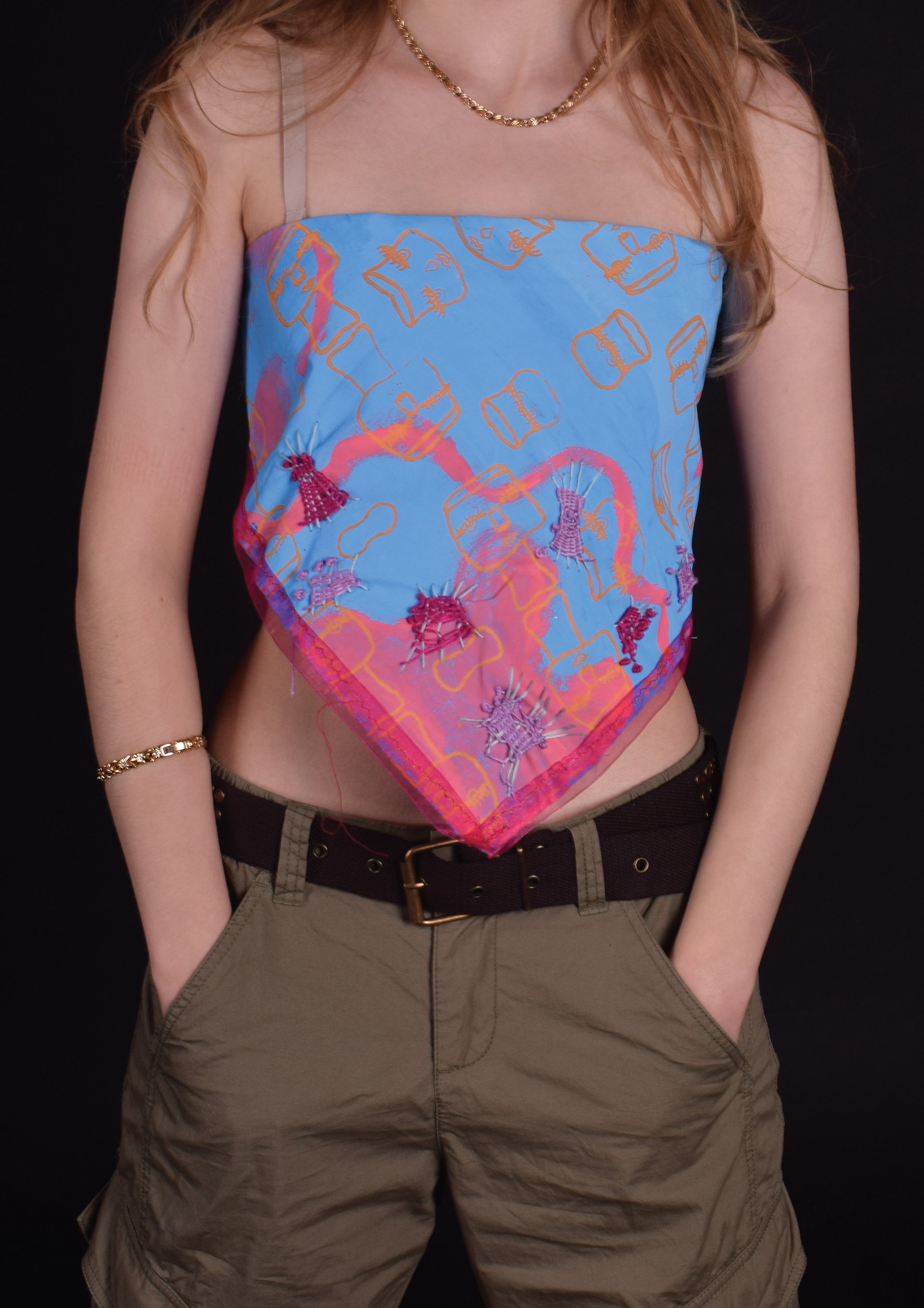
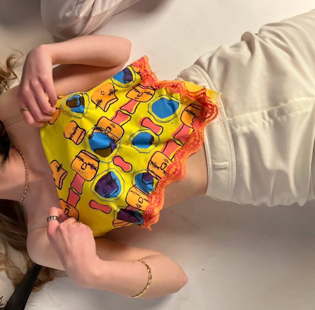
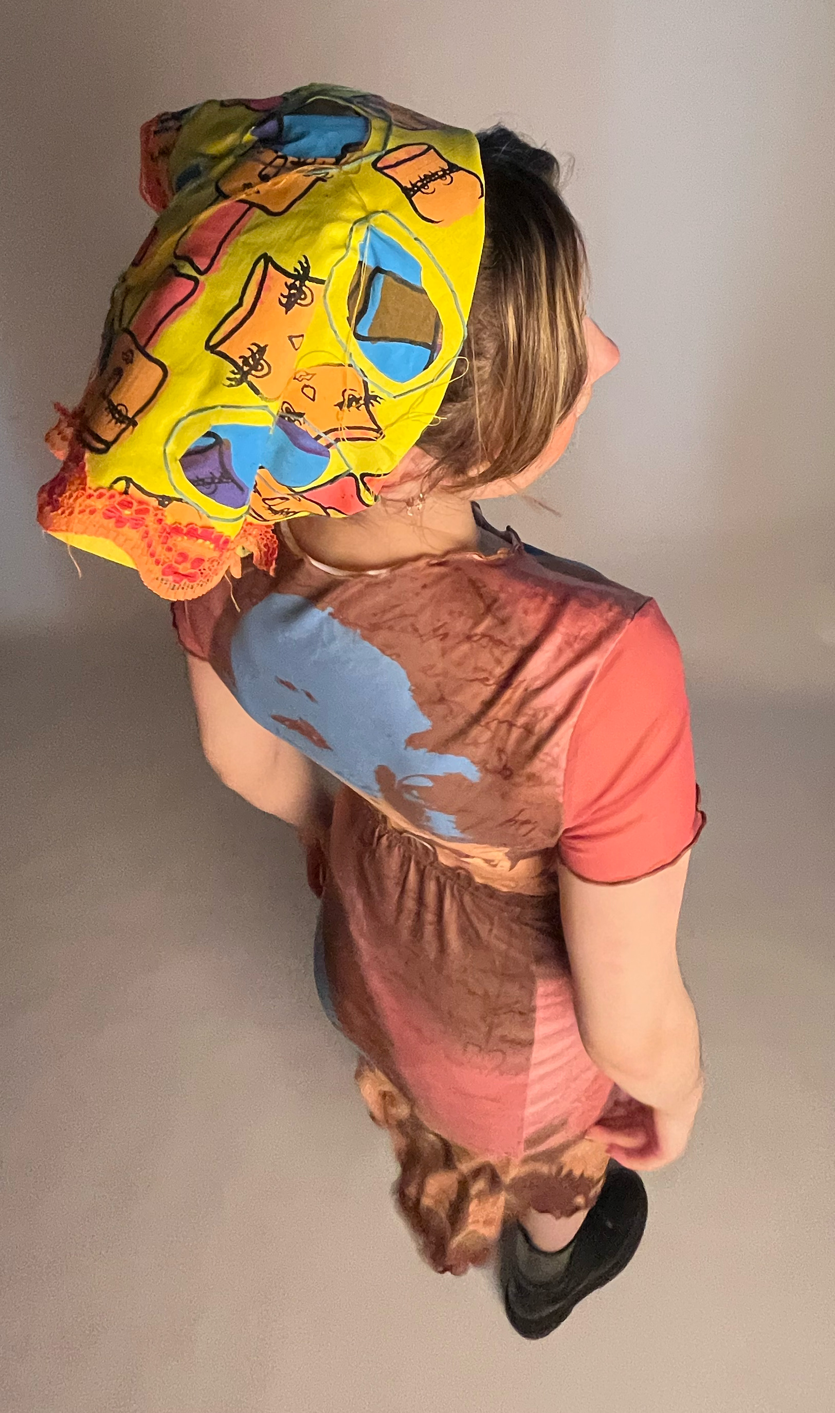
I have exhibited a collection of 3 bandannas which show different colours and meanings. I took inspiration from artists and films to make a surrealist pattern design with human features to make it come alive and allure the viewer to be pulled into the piece. I have then developed the piece and layered different textures to give 3D atmosphere and dimension, again to allure the viewer to experience my personal dream. I used reverse applique, to give a strong colourful hint of illusion, showing two different colours/dreams clashing together. I used weaving techniques to add a 3D dimension and texture to make it feel more alive. The colours represent different things, for example orange for hopefulness and purple for a mystic feeling , blue for tranquility and yellow represents a big change in life.
I have exhibited a collection of 3 bandannas which show different colours and meanings. I took inspiration from artists and films to make a surrealist pattern design with human features to make it come alive and allure the viewer to be pulled into the piece. I have then developed the piece and layered different textures to give 3D atmosphere and dimension, again to allure the viewer to experience my personal dream. I used reverse applique, to give a strong colourful hint of illusion, showing two different colours/dreams clashing together. I used weaving techniques to add a 3D dimension and texture to make it feel more alive. The colours represent different things, for example orange for hopefulness and purple for a mystic feeling , blue for tranquility and yellow represents a big change in life.

Pelham Birchfield
Employment
Employment
Busy
I have exhibited a collection of lino block prints which follow my theme of ‘Busy’. I have explored different areas of busyness and tried to portray the feeling of harmony with layers and busy patterns and forms. The variety of browns and rusty reds in the prints resemble the type of colours and feelings you would associate with large brick houses and buildings, and the blues are used to contrast those warmer areas and to flow between each focus point. I focused on architecture from both reality and fiction with the main focus of the market being taken from a sticker and the smaller prints being taken by me at Cambridge.
I have exhibited a collection of lino block prints which follow my theme of ‘Busy’. I have explored different areas of busyness and tried to portray the feeling of harmony with layers and busy patterns and forms. The variety of browns and rusty reds in the prints resemble the type of colours and feelings you would associate with large brick houses and buildings, and the blues are used to contrast those warmer areas and to flow between each focus point. I focused on architecture from both reality and fiction with the main focus of the market being taken from a sticker and the smaller prints being taken by me at Cambridge.
Chloe Brooks
Norwich University of the Arts (BA) Hons Graphic Design
Norwich University of the Arts (BA) Hons Graphic Design
Process
I have exhibited 2 series of mixed media postcards. As my theme is ‘Process’, I have explored various different techniques and the process of creating them. Throughout doing this I have picked out my favorites and put these into my final exhibition piece. In the postcards I have used watercolour and collage to create bright, bold and abstract designs that stand out from typical landscape postcards.
I have exhibited 2 series of mixed media postcards. As my theme is ‘Process’, I have explored various different techniques and the process of creating them. Throughout doing this I have picked out my favorites and put these into my final exhibition piece. In the postcards I have used watercolour and collage to create bright, bold and abstract designs that stand out from typical landscape postcards.
Kayleigh Chaplin
Employment
Employment
Sentimental Tattoo
Here I have exhibited a digital piece of work that I have created for a client that has asked me to design a sentimental piece for her. I have only used digital components in the colours black and white as this is what the client asked for. This is to make the design more memorable as the tattoo synthesises the empathy of a lost child. The skeleton represents the miscarriage and the wings symbolises the angel up in heaven.
Here I have exhibited a digital piece of work that I have created for a client that has asked me to design a sentimental piece for her. I have only used digital components in the colours black and white as this is what the client asked for. This is to make the design more memorable as the tattoo synthesises the empathy of a lost child. The skeleton represents the miscarriage and the wings symbolises the angel up in heaven.
Laura Dundeniece
Norwich University of the Arts BA (Hons) Architecture
Norwich University of the Arts BA (Hons) Architecture
Contemporary Architecture
I have exhibited an architectural model of a redeveloped bakery, where I am currently employed. My contemporary part lies within the shape of the structured building as it is based on octagons and rectangles. This gives the rooms more area to work in for a business that is busy on a daily basis. The upstairs of the building is designed from an unused area into a small but spacious apartment. This was made out of foam board and white cardboard assembled together with PVA glue.
I have exhibited an architectural model of a redeveloped bakery, where I am currently employed. My contemporary part lies within the shape of the structured building as it is based on octagons and rectangles. This gives the rooms more area to work in for a business that is busy on a daily basis. The upstairs of the building is designed from an unused area into a small but spacious apartment. This was made out of foam board and white cardboard assembled together with PVA glue.
Octavia Elliss
Employment
Employment
Japanese Mask Linoprint
I have exhibited four linoleum block prints. The prints are of two different masks I fuesd together. I explored many of the masks in Japanese culture, then narrowed it down to two very different masks. These masks are ‘kitsune’ which is the mask of the fox spirit, and the ‘Oni’ mask that is a demon's mask. I really needed to think through my design a few times before I was happy with the outcome. Once I had worked out how the masks fit together I transferred my work to my tablet for further edits on ibisPaint. This was helpful as my first lino design had too many details to carve, so I had to go back to the drawing. I had to take some details out and make my lines thicker so it wasn't too thin when I printed.
I have exhibited four linoleum block prints. The prints are of two different masks I fuesd together. I explored many of the masks in Japanese culture, then narrowed it down to two very different masks. These masks are ‘kitsune’ which is the mask of the fox spirit, and the ‘Oni’ mask that is a demon's mask. I really needed to think through my design a few times before I was happy with the outcome. Once I had worked out how the masks fit together I transferred my work to my tablet for further edits on ibisPaint. This was helpful as my first lino design had too many details to carve, so I had to go back to the drawing. I had to take some details out and make my lines thicker so it wasn't too thin when I printed.
Deanna Fowler
University of Suffolk BA (Hons) Graphic Design (Graphic Illustration)
University of Suffolk BA (Hons) Graphic Design (Graphic Illustration)
KEEP YOUR LAWS OFF MY BODY
I have exhibited a digital piece of artwork created on the programme Procreate. My piece is based on a major issue in today's society, mental health. I am extremely passionate about raising awareness after losing my cousin in 2019. All of my work is dedicated to Megan Haggar. I have particularly based my work around the “ KEEP YOUR LAWS OFF MY BODY” movement in an aim to raise awareness in asserting women's rights. This piece has been created in the style of pop art and comic book halftone, inspired by Roy Litchenstein.
I have exhibited a digital piece of artwork created on the programme Procreate. My piece is based on a major issue in today's society, mental health. I am extremely passionate about raising awareness after losing my cousin in 2019. All of my work is dedicated to Megan Haggar. I have particularly based my work around the “ KEEP YOUR LAWS OFF MY BODY” movement in an aim to raise awareness in asserting women's rights. This piece has been created in the style of pop art and comic book halftone, inspired by Roy Litchenstein.
Zoë Foxlow
University of Suffolk BA (Hons) Graphic Design
University of Suffolk BA (Hons) Graphic Design
The power of color
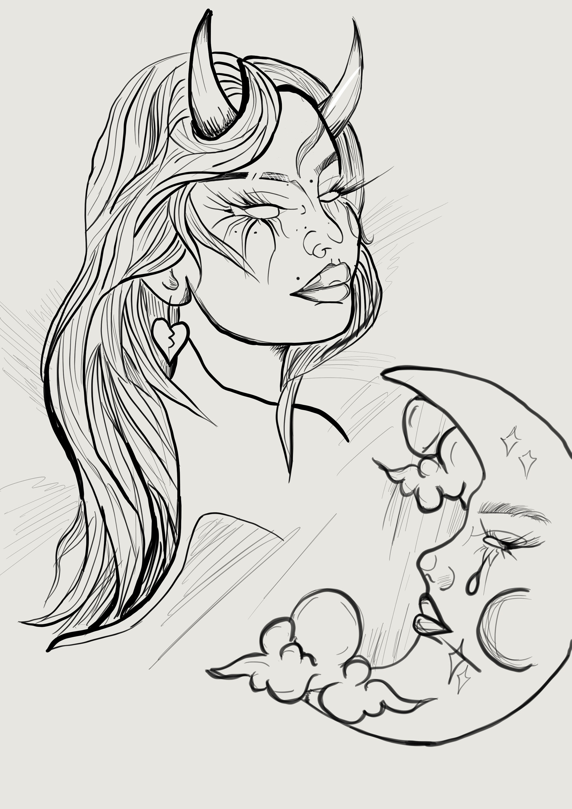
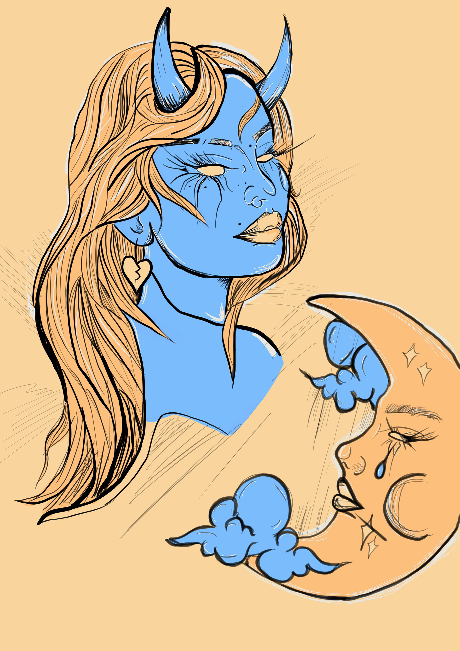
My two images are based on the power of color. The illustration creates a contrasting color pallet. The color in the second image shows how it has the ability to change the perspective of an image and further bring it to life. The purpose of my piece is to portray a symbolic representation of mental health in a positive manner when color is added.
My two images are based on the power of color. The illustration creates a contrasting color pallet. The color in the second image shows how it has the ability to change the perspective of an image and further bring it to life. The purpose of my piece is to portray a symbolic representation of mental health in a positive manner when color is added.
Carla Gillies-Green
University of South Wales BA (Hons) Television & Film Set Design
University of South Wales BA (Hons) Television & Film Set Design
Privacy is a Crime
I have exhibited an advert styled like the “Piracy is a Crime” advert. I wanted to study the 21st century's lack of privacy in a style I like. I’ve explored some of the many ways people of the 21st century view privacy, I’ve spoken to people about their views on it, most of them saying it’s not something they’ve considered. I’m also hoping this video will aid in putting a stop to crime “you wouldn’t steal a car…. You wouldn’t steal a handbag….” by showing how everyone is constantly being watched.
I have exhibited an advert styled like the “Piracy is a Crime” advert. I wanted to study the 21st century's lack of privacy in a style I like. I’ve explored some of the many ways people of the 21st century view privacy, I’ve spoken to people about their views on it, most of them saying it’s not something they’ve considered. I’m also hoping this video will aid in putting a stop to crime “you wouldn’t steal a car…. You wouldn’t steal a handbag….” by showing how everyone is constantly being watched.
Jordan Goodchild
University of Suffolk BA (Hons) Graphics & Illustration
University of Suffolk BA (Hons) Graphics & Illustration
Self development
The work I've presented is based on artists that have influenced me throughout my time at college. I normally work in pencil, and my drawings are usually described as loose and wild. During my Final Major Project I wanted to try some new materials in my work. My aim was to focus on my own personal artistic development and learn new methods of working. I have presented 3 illustrations inspired by a range of artists and images, created using mixed media including pencil, brush pens and ink.
The work I've presented is based on artists that have influenced me throughout my time at college. I normally work in pencil, and my drawings are usually described as loose and wild. During my Final Major Project I wanted to try some new materials in my work. My aim was to focus on my own personal artistic development and learn new methods of working. I have presented 3 illustrations inspired by a range of artists and images, created using mixed media including pencil, brush pens and ink.
Isobel Goutremout
Employment
Harajuku Fashion in Western Culture
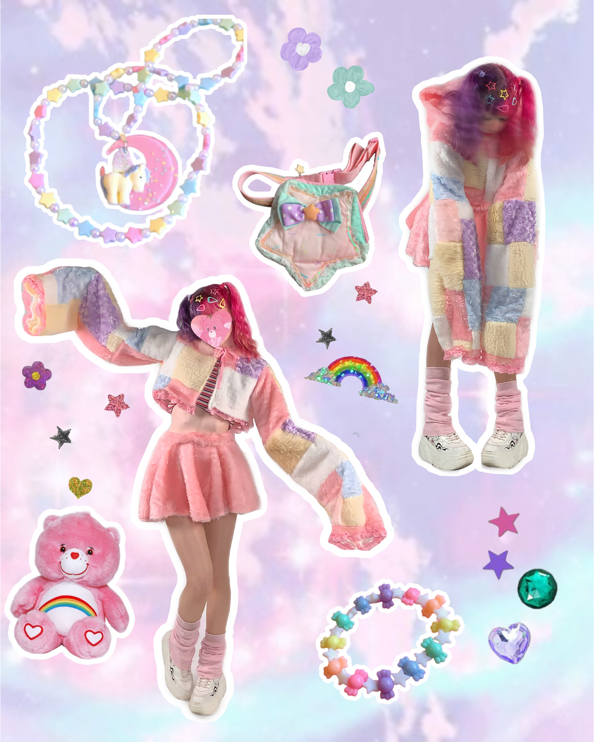
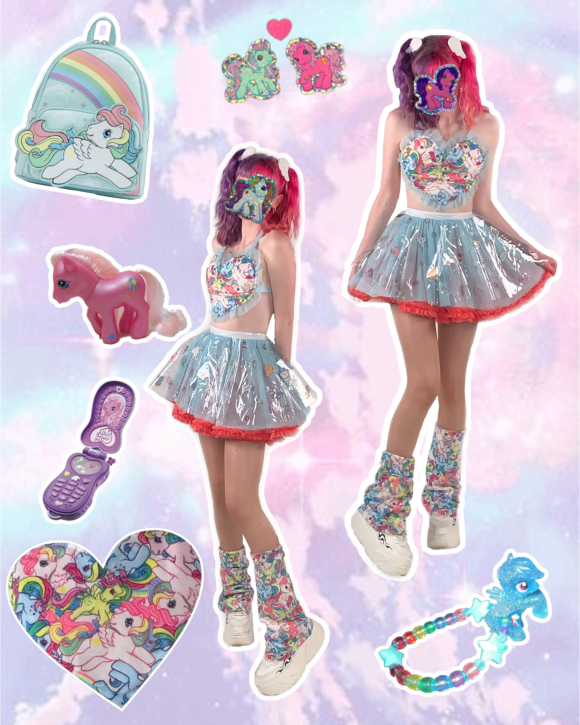
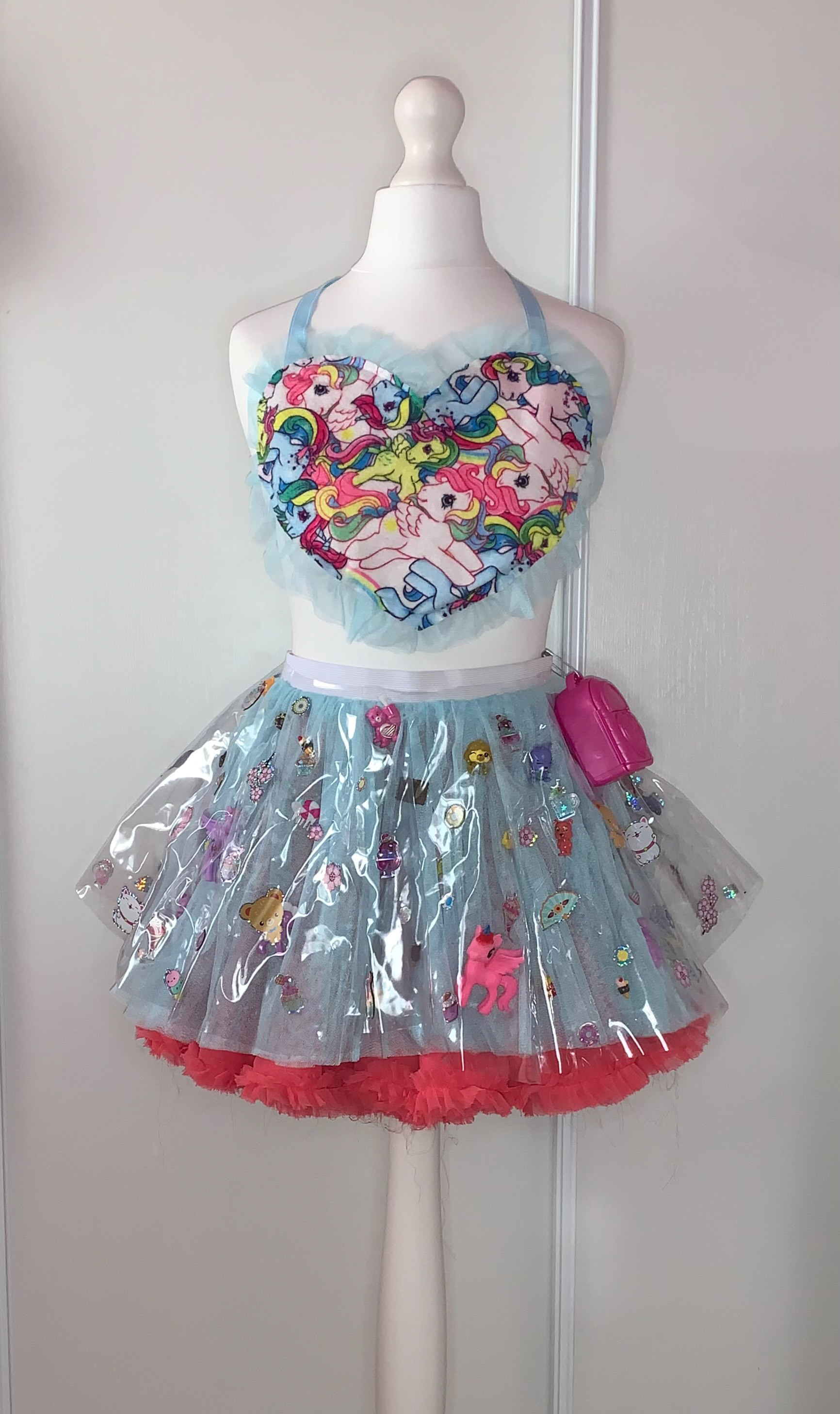
I have exhibited a collection of outfits inspired by various Harajuku street styles. I explored three styles similar in aesthetic to fit an overall similar look. Using techniques I have learnt through past projects, I wanted to use a large variety of materials to push myself out of my comfort zone and experiment with how contrasting textures can create a unique outcome. This style is something I have admired for as long as I can remember and has greatly influenced my own personal style and view of fashion, and is something I wanted to encapsulate for this project to show more people the possibilities of Japanese culture in western society.
I have exhibited a collection of outfits inspired by various Harajuku street styles. I explored three styles similar in aesthetic to fit an overall similar look. Using techniques I have learnt through past projects, I wanted to use a large variety of materials to push myself out of my comfort zone and experiment with how contrasting textures can create a unique outcome. This style is something I have admired for as long as I can remember and has greatly influenced my own personal style and view of fashion, and is something I wanted to encapsulate for this project to show more people the possibilities of Japanese culture in western society.

Alice Green
Norwich University of the Arts - BA (Hons) Graphic Design + Part time employment at a Local Graphic Design Agency
Norwich University of the Arts - BA (Hons) Graphic Design + Part time employment at a Local Graphic Design Agency
Visual Brand Identity Through the Art Movements
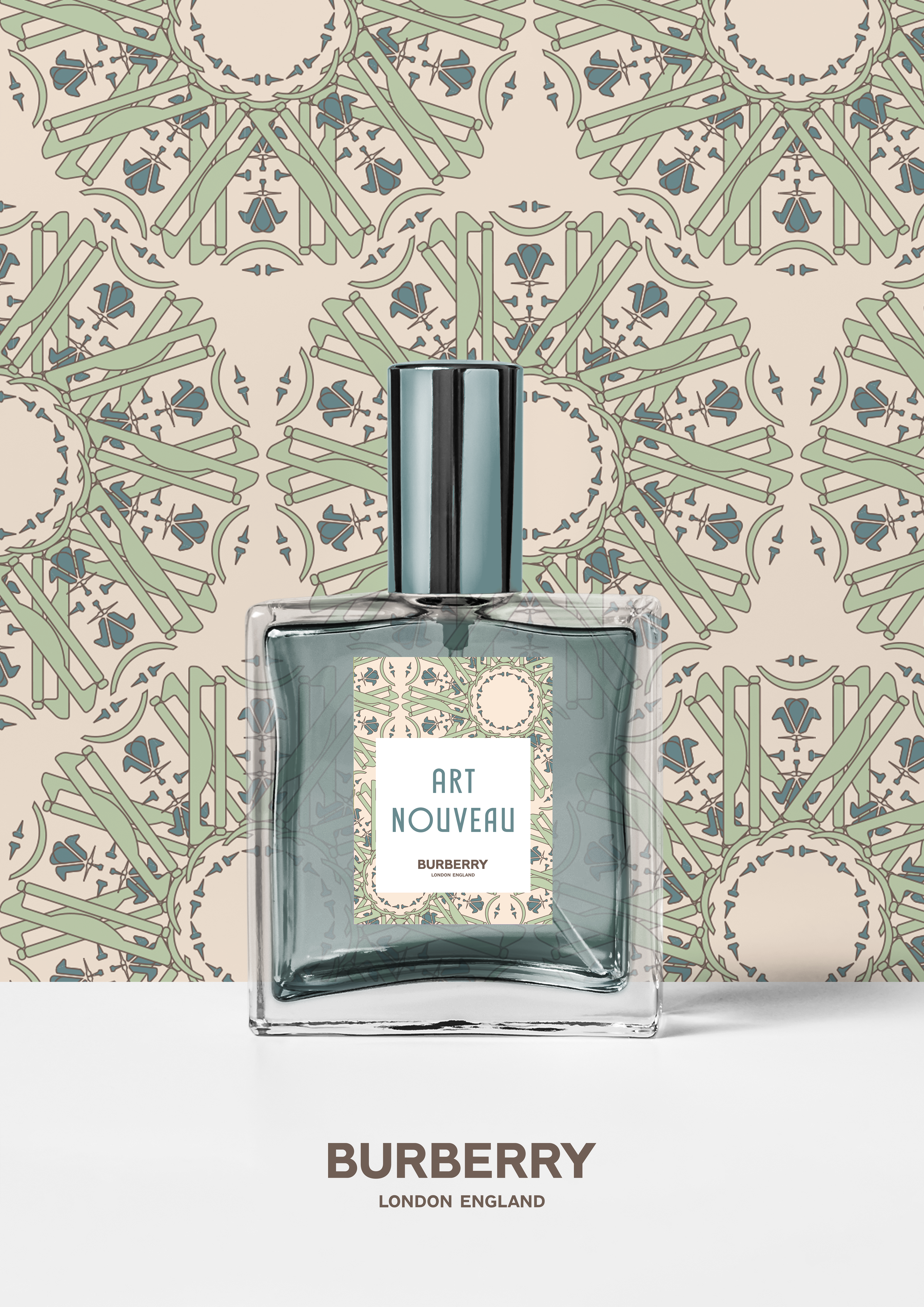
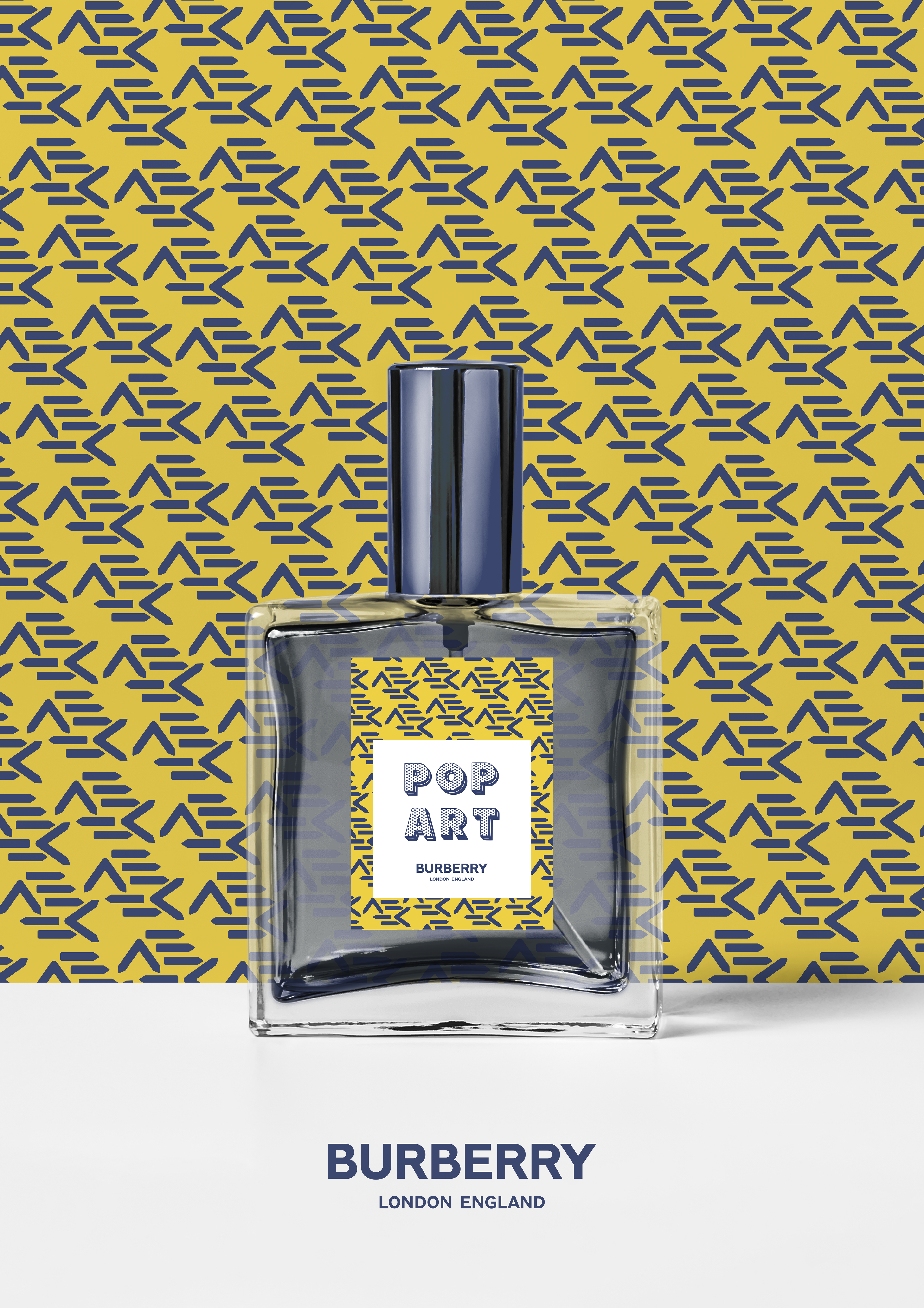
Here I have exhibited a collection of advertisement posters for a limited edition range of Burberry perfumes, inspired by three contrasting art movements - Cubism, Art Nouveau and Pop Art. Fueled by my research into my appeal of brand identity and visual identity, I was massively inspired by a field trip to London where I established a high class target audience to build from. I have always loved the power of using strong contrast, and I plan to continue down this path as I develop my own personal style as a graphic designer.
Here I have exhibited a collection of advertisement posters for a limited edition range of Burberry perfumes, inspired by three contrasting art movements - Cubism, Art Nouveau and Pop Art. Fueled by my research into my appeal of brand identity and visual identity, I was massively inspired by a field trip to London where I established a high class target audience to build from. I have always loved the power of using strong contrast, and I plan to continue down this path as I develop my own personal style as a graphic designer.

Arturas “AK” Jachimovicius
Norwich University of the Arts BA (Hons) Photography
Norwich University of the Arts BA (Hons) Photography
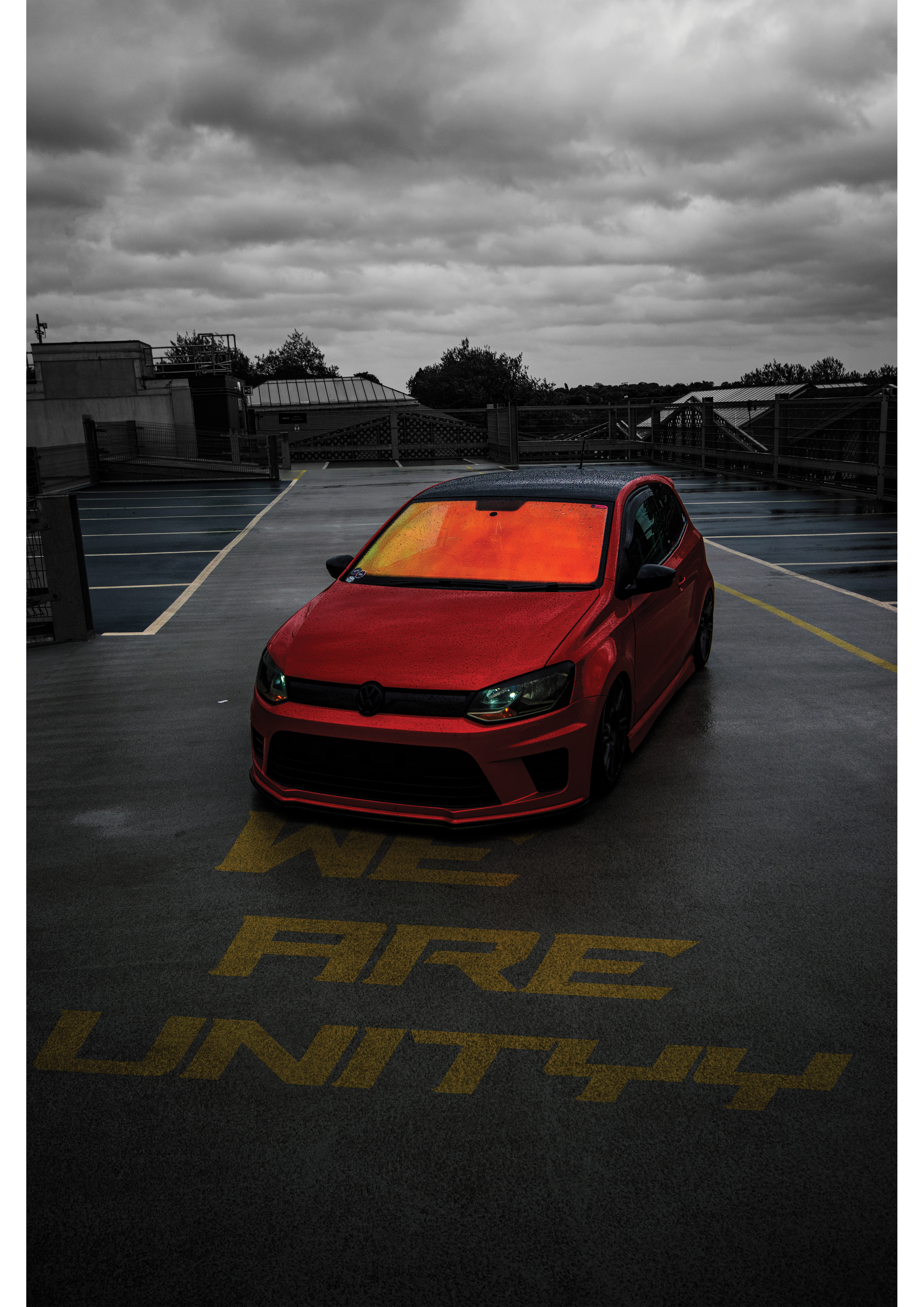
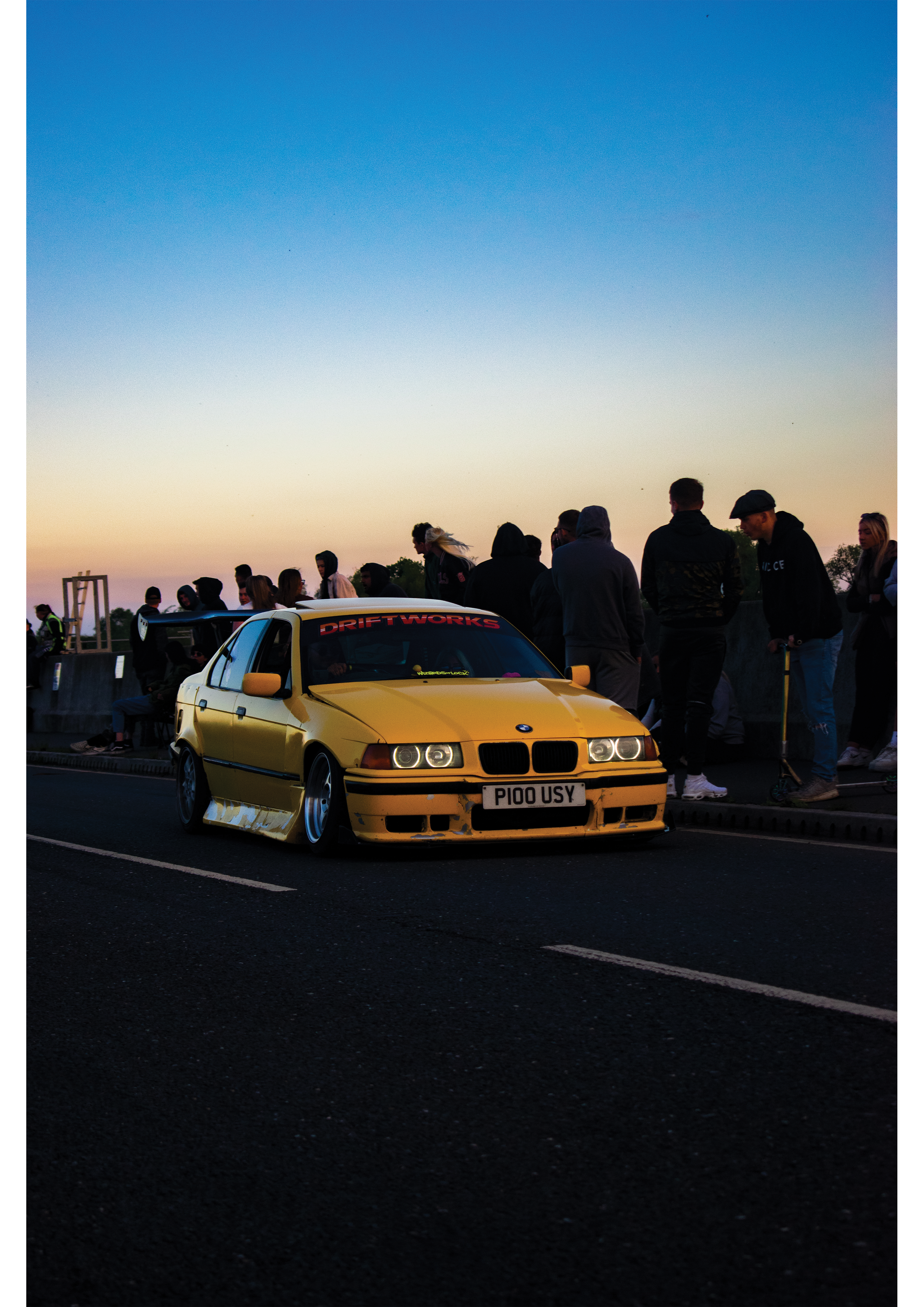
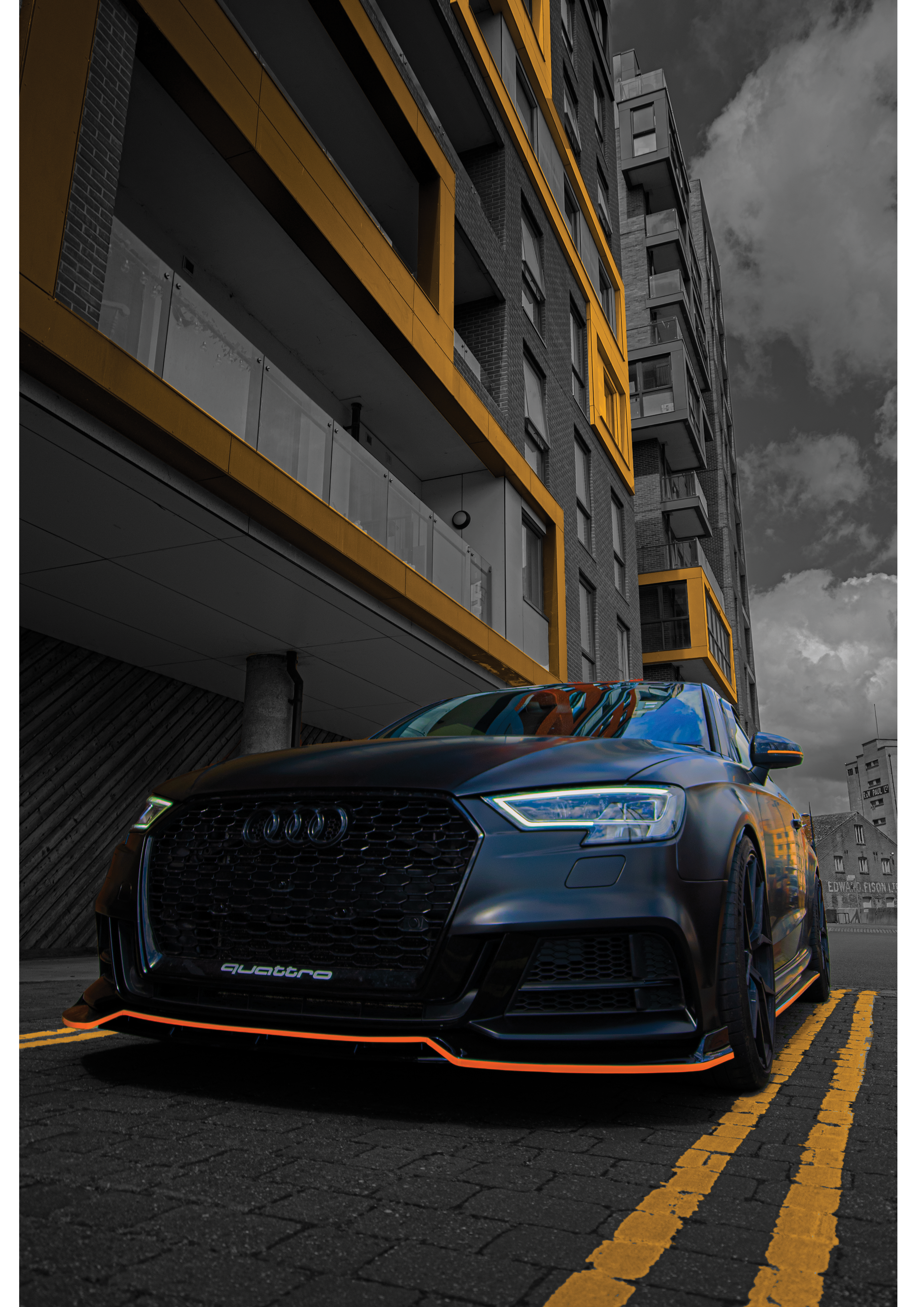
UNITY
Look for yourself as Albert Einstein once said an “image is worth a thousand words”
Look for yourself as Albert Einstein once said an “image is worth a thousand words”
Alfie Lang
Employment
Employment
Hong Kong Movie Poster
I have presented an 80’s - 90’s themed Hong Kong action movie poster. I created this piece as I always found the theme of Hong Kong action very interesting; the animated fight scenes and interesting characters are what I wanted to try and replicate within my outcome. Additionally, I wanted to add a grindhouse style to the project by using a limited colour palette and adding a texture to give a vintage feel and aesthetic.
I have presented an 80’s - 90’s themed Hong Kong action movie poster. I created this piece as I always found the theme of Hong Kong action very interesting; the animated fight scenes and interesting characters are what I wanted to try and replicate within my outcome. Additionally, I wanted to add a grindhouse style to the project by using a limited colour palette and adding a texture to give a vintage feel and aesthetic.
Nadine Elsie Lawrance
Derby University BA (Hons) Fine Art
Derby University BA (Hons) Fine Art
Beautiful Mess
For my FMP I wanted to incorporate aspects of my real world. I struggle, just like everyone, with mental health and whenever I feel my state getting too bad I like to sit down and let it all out on a blank canvas just so I can look at it and try to understand everything. Sometimes it's messy and sometimes it can be really beautiful, but the process and the sensation of creating art always heals me, and to me that is something to be grateful for. My project is a self portrait, an oil painting about my mental health using a range of different colors to convey and evoke emotions. I hope everyone can really get in touch with each and every feeling in their own way. The piece is called ‘Beautiful Mess’ to manifest the different ways my painting can be interpreted but to also portray myself in a way that shows that after a really long time of only seeing the mess, I'm finally starting to accept the beauty that comes with struggle.
Sofia Leite Da Silva Pereira
Employment.
Employment.
Natural Beauty.
I have exhibited a painting on natural beauty and nature, to portray how perfect the human body is as nature and how we are connected to it, my work show that inner beauty is important and why i used “thermal” camera as a source of inspiration but the colors represent auras and a peace of mind with its own body, I have the spiral of flowers and a symbol of nature embracing our imperfections and perfections and as a protection from negativity.
I have exhibited a painting on natural beauty and nature, to portray how perfect the human body is as nature and how we are connected to it, my work show that inner beauty is important and why i used “thermal” camera as a source of inspiration but the colors represent auras and a peace of mind with its own body, I have the spiral of flowers and a symbol of nature embracing our imperfections and perfections and as a protection from negativity.
Chloe Mitchell
Ravensbourne University London BA (Hons) Interior Design Environment Architectures
Ravensbourne University London BA (Hons) Interior Design Environment Architectures
Interior Design
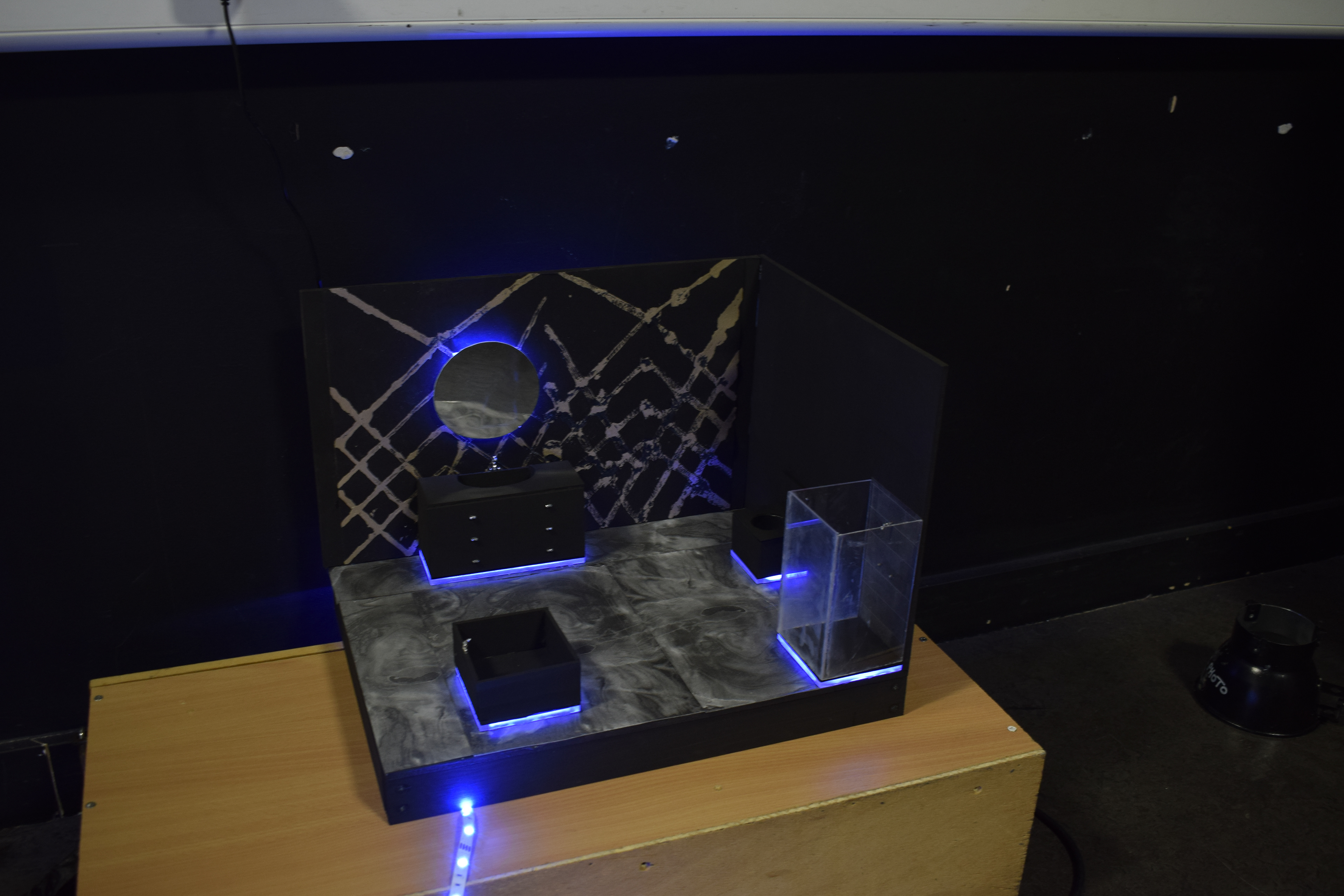
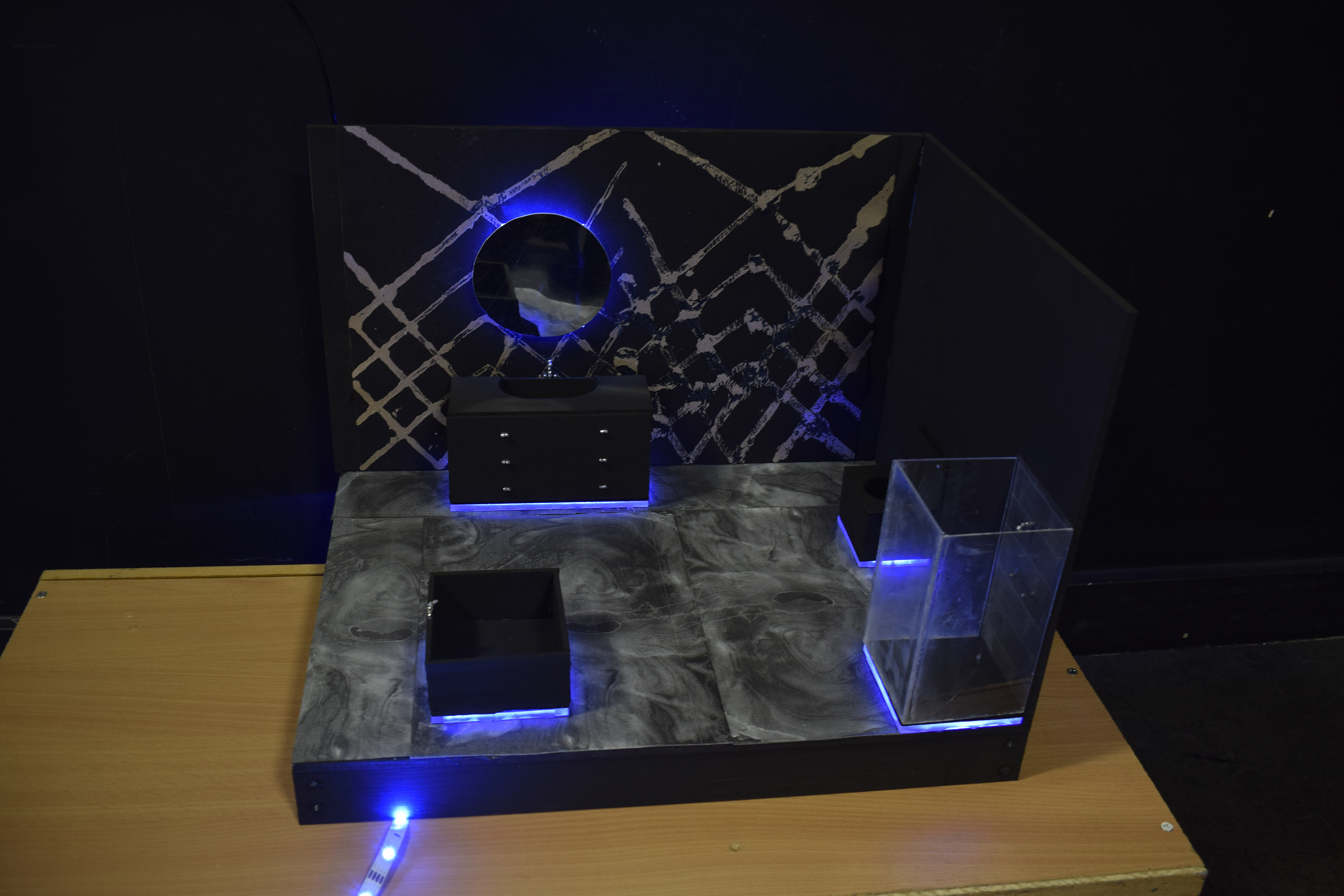
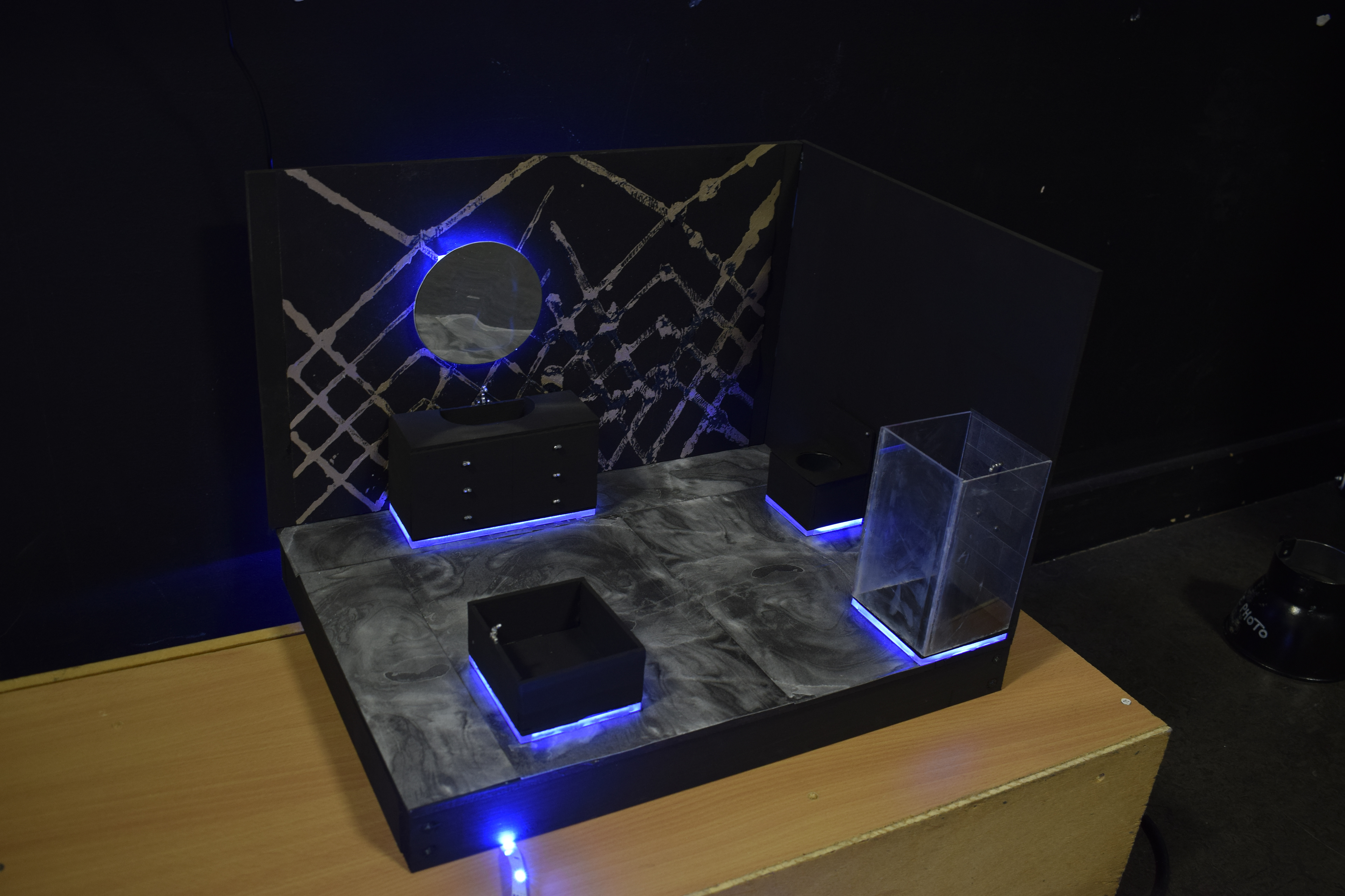
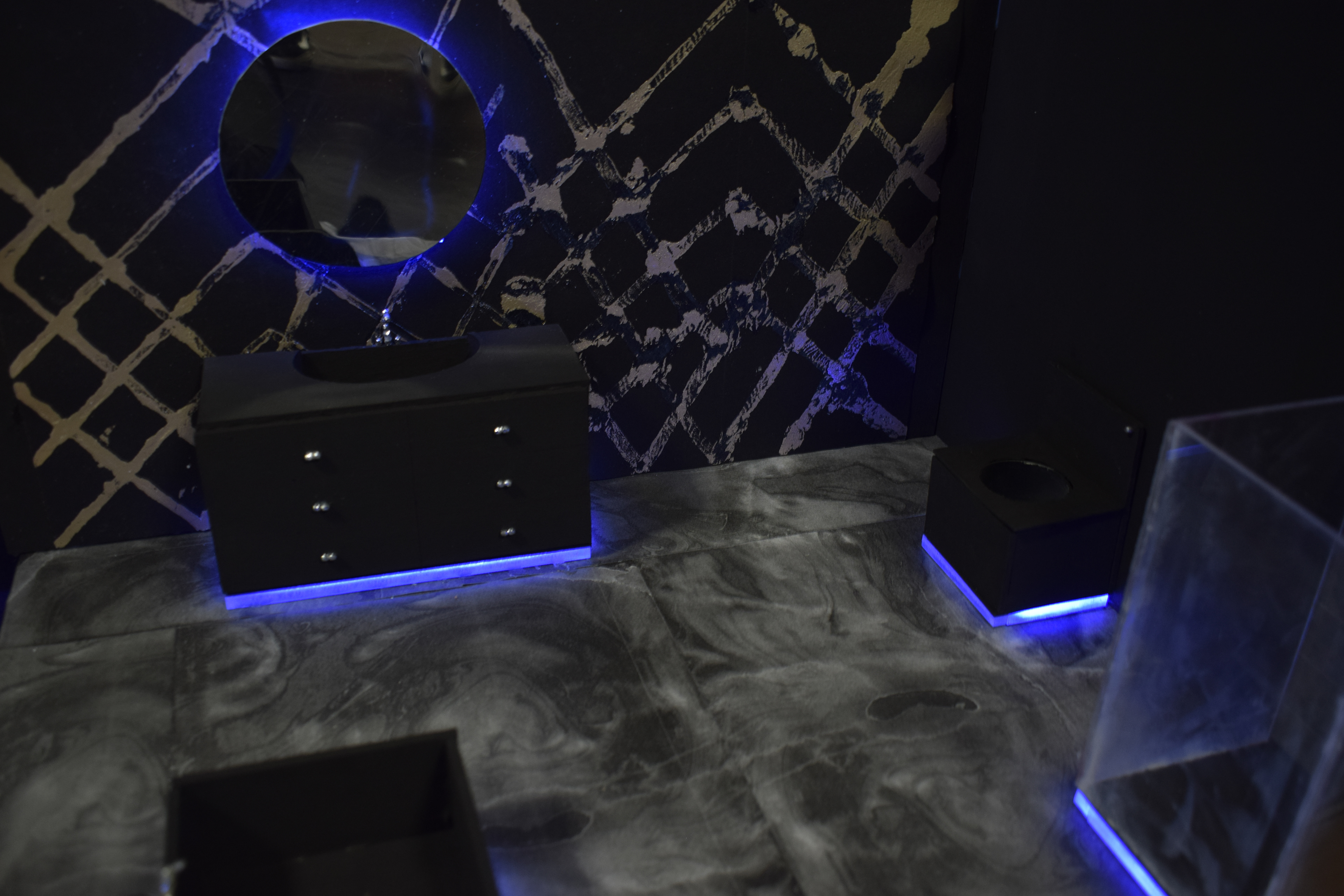
I have exhibited a maquette of a bathroom. As my theme is interior design I thought making a maquete would be the best way to represent the ideas I had of a modern, high end bathroom. I have designed all the furniture, chosen a layout and created wallpaper and flooring. The wallpaper was created by foiling and the floor by marbling. LED lighting is used to accentuate the furniture in the bathroom.
I have exhibited a maquette of a bathroom. As my theme is interior design I thought making a maquete would be the best way to represent the ideas I had of a modern, high end bathroom. I have designed all the furniture, chosen a layout and created wallpaper and flooring. The wallpaper was created by foiling and the floor by marbling. LED lighting is used to accentuate the furniture in the bathroom.
Shane Mongan
Further Education
Further Education
Adaptive Clothing
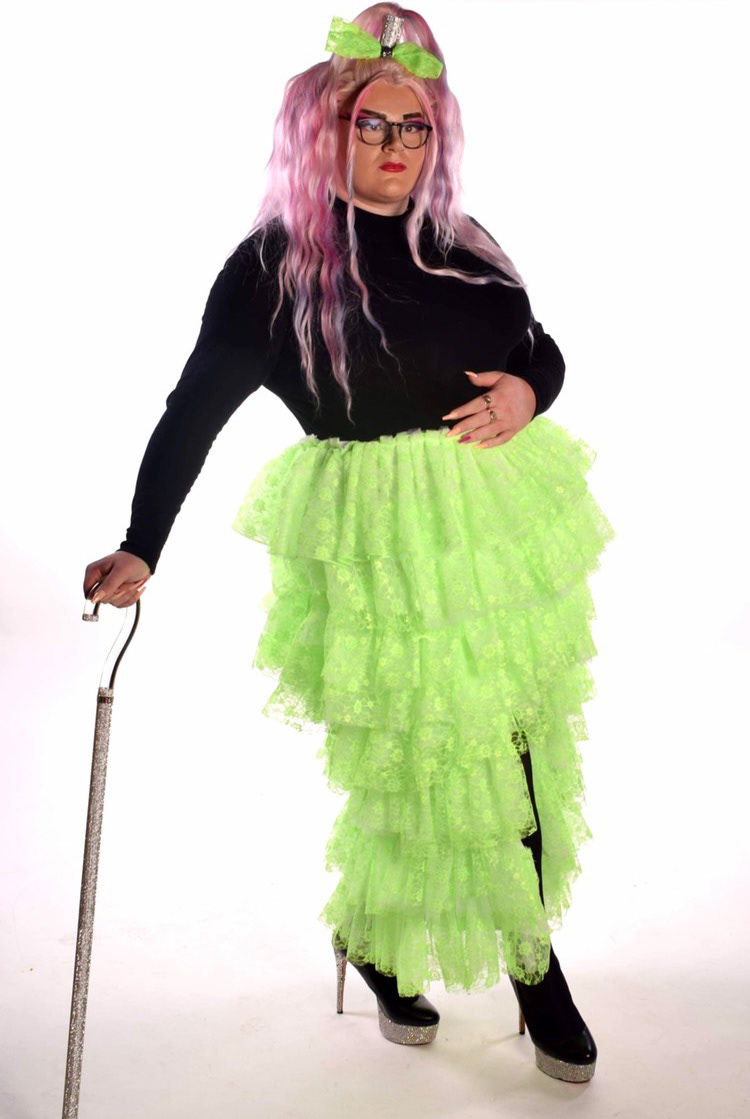
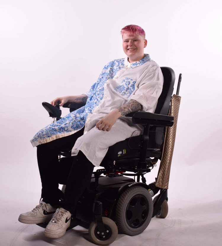
My exhibition is based on adaptive clothing for the disabled. I have explored different contemporary fashion designers for inspiration such as Dior and also Tommy Hilfiger who designed a collection for people with a disability. The two exhibits include a long shirt which could be used as an everyday piece and incorporates magnetic clasps into the shirt button seam to make it easily accessible for a person with limited hand dexterity. The other outcome is a fashion outfit made with fluorescent green toile fabric for a drag queen which aims to embrace the flamboyant and elaborate elements of the art form. In addition, I designed several accessory pieces to compliment the outfit such as an embellished harness, clutch bag and wrist strap which uses the same laced toile fabric.
My exhibition is based on adaptive clothing for the disabled. I have explored different contemporary fashion designers for inspiration such as Dior and also Tommy Hilfiger who designed a collection for people with a disability. The two exhibits include a long shirt which could be used as an everyday piece and incorporates magnetic clasps into the shirt button seam to make it easily accessible for a person with limited hand dexterity. The other outcome is a fashion outfit made with fluorescent green toile fabric for a drag queen which aims to embrace the flamboyant and elaborate elements of the art form. In addition, I designed several accessory pieces to compliment the outfit such as an embellished harness, clutch bag and wrist strap which uses the same laced toile fabric.
Shannon Mongan
Employment
Employment
Metamorphosis
I have exhibited a simplistic silhouette representing the different stages of grief and the body language corresponding to the stage. I used the app procreate to create the piece submitted because of the sharpness of lines. I looked heavily into colour theory to connect a colour with the feelings but also the colours that I think links to it. I used ink a lot when experimenting as it gave off a really vibrant version of colours.
I have exhibited a simplistic silhouette representing the different stages of grief and the body language corresponding to the stage. I used the app procreate to create the piece submitted because of the sharpness of lines. I looked heavily into colour theory to connect a colour with the feelings but also the colours that I think links to it. I used ink a lot when experimenting as it gave off a really vibrant version of colours.
Madara Orlova
Employment
Employment
Nature on Wood
This is my collection of 4 wood slices painted on with acrylic paint in black and white incorporating aspects of nature throughout the pieces. They all are paintings of photos I took personally on a nature walk to gain inspiration for this project. Even though all share the same style being in black and white and painted with acrylic, I have tried using various techniques throughout. With close-ups of flowers and looking into the distance using perspective. then have the use of reflection for the trees in the river and finally a portrait of a furry friend, a dog.
This is my collection of 4 wood slices painted on with acrylic paint in black and white incorporating aspects of nature throughout the pieces. They all are paintings of photos I took personally on a nature walk to gain inspiration for this project. Even though all share the same style being in black and white and painted with acrylic, I have tried using various techniques throughout. With close-ups of flowers and looking into the distance using perspective. then have the use of reflection for the trees in the river and finally a portrait of a furry friend, a dog.
Skye Patterson
Employment
Employment
Gender Identities
The aim of this project was to educate people on the topic of gender identity. Different gender identities are still not widely accepted and this is usually due to people not being properly educated on the topic. I was hoping to make people feel a range of different emotions when watching my film, including empathy. I don't want to make them pity those that identify as gender non-conforming, I want for them to think before they mistreat someone because of how they identify.
The aim of this project was to educate people on the topic of gender identity. Different gender identities are still not widely accepted and this is usually due to people not being properly educated on the topic. I was hoping to make people feel a range of different emotions when watching my film, including empathy. I don't want to make them pity those that identify as gender non-conforming, I want for them to think before they mistreat someone because of how they identify.
Abigail pearce
Suffolk New College Level 3 Foundation Diploma in Art & Design
Suffolk New College Level 3 Foundation Diploma in Art & Design
Mental health
I will be putting a piece into the exhibition that is called ‘the hug’ and the theme that I gave myself was mental health. I have always wanted to create mental health awareness for schools and adults in different generations to hopefully give people a different mindset around mental health for young people, and to be more aware that a lot of teenagers and adults in their 20s struggle a lot differently to other generations due to social media which leads to: cyber bullying, bullying in schools, body dysmorphia, dissociation, anxiety and depression. My piece is made from recycled tops just like Louise bourgeois. Bourgeois used her old tee shirts to help her through her childhood trauma and mental health. She had a lot of inspiration for my work.
Elliot Pepper
University of Plymouth BA (Hons) Architecture
University of Plymouth BA (Hons) Architecture
From Russia With Love
I have exhibited a graphics piece that represents modern propaganda, yet nods towards the historical war propaganda posters. The reason I chose to do graphics is because I really enjoy it and I may never really step into the graphics world again so, for me, this work is a goodbye to that style. My objective with my work is to look at current world issues and respond to them. With this piece I focussed on the Russian/Ukrainian war and how helpless civilians have been attacked. I have used a minimalist style using negative space that few people may notice, which is actually appealing to me, for people to have to look harder to see more. I rarely use text in my work but when I do, I really like it, especially in this piece with the sarcastic question that makes you think how far we haven't come from past wars.
I have exhibited a graphics piece that represents modern propaganda, yet nods towards the historical war propaganda posters. The reason I chose to do graphics is because I really enjoy it and I may never really step into the graphics world again so, for me, this work is a goodbye to that style. My objective with my work is to look at current world issues and respond to them. With this piece I focussed on the Russian/Ukrainian war and how helpless civilians have been attacked. I have used a minimalist style using negative space that few people may notice, which is actually appealing to me, for people to have to look harder to see more. I rarely use text in my work but when I do, I really like it, especially in this piece with the sarcastic question that makes you think how far we haven't come from past wars.
Beatriz Pinto
Anglia Ruskin University Cambridge Campus BA (Hons) Interior Design
Interior Design
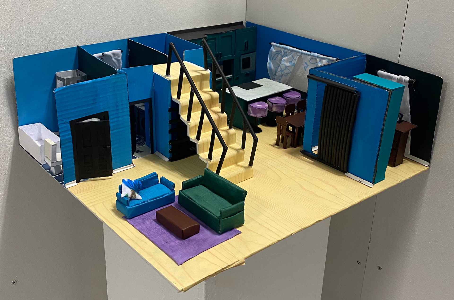
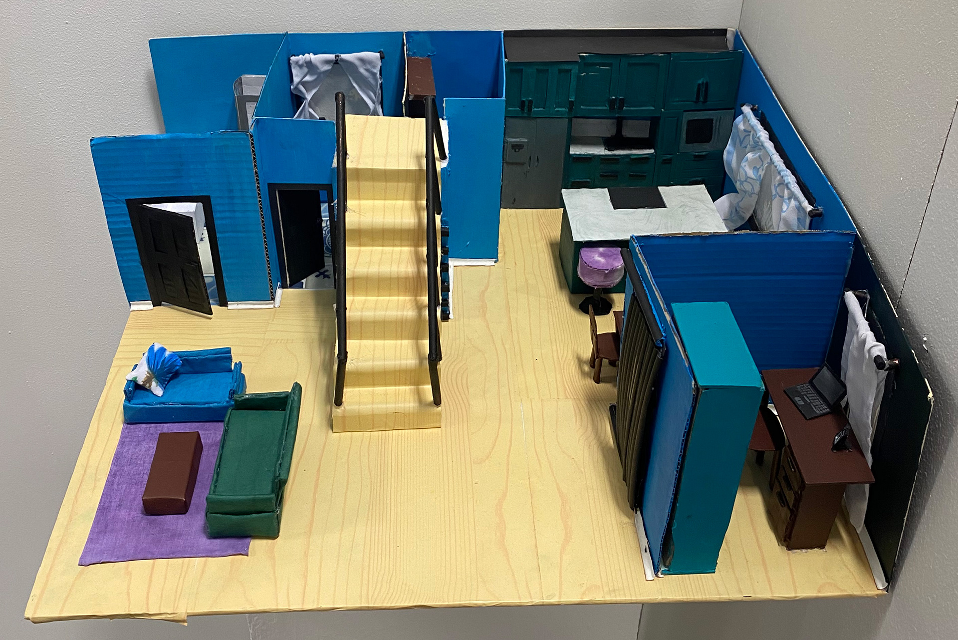
I have exhibited a maquette portraying the entire downstairs of a house which includes a bathroom, laundry room, office and an open concept living room/kitchen and dining area. All the rooms in the maquete are fully furnished and decorated. I have used recycled materials to create all the furniture and structure, such as found cardboard boxes, cereal boxes and left over fabrics. I decided to create my maquete on a large piece of foam board to make sure I would be able to present large enough decor that the viewer will be able to observe my piece and enjoy the detail.
I have exhibited a maquette portraying the entire downstairs of a house which includes a bathroom, laundry room, office and an open concept living room/kitchen and dining area. All the rooms in the maquete are fully furnished and decorated. I have used recycled materials to create all the furniture and structure, such as found cardboard boxes, cereal boxes and left over fabrics. I decided to create my maquete on a large piece of foam board to make sure I would be able to present large enough decor that the viewer will be able to observe my piece and enjoy the detail.
Joe Polley
University of Suffolk BA (Hons) Fine Art
To See art On more than just Walls.
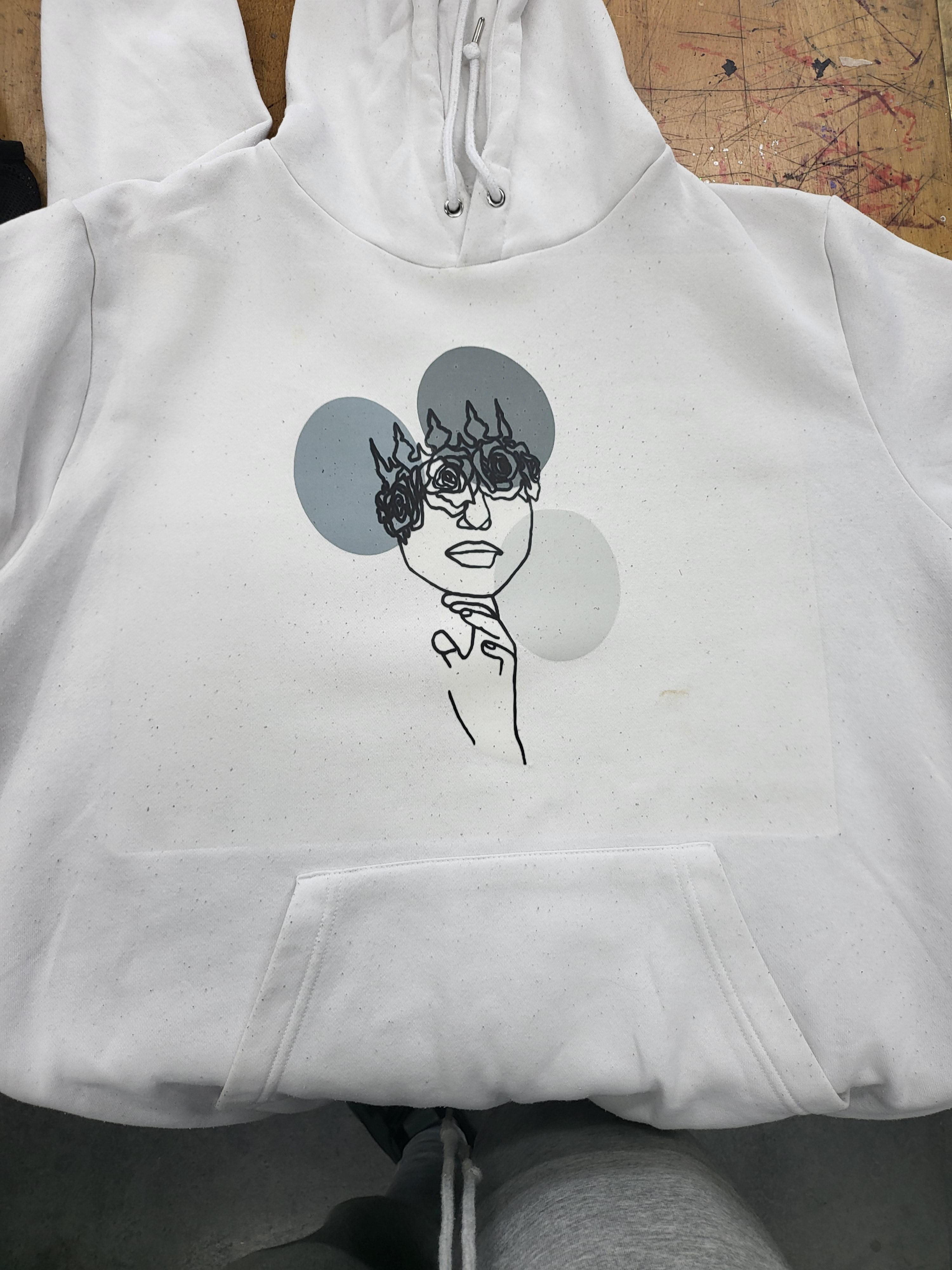
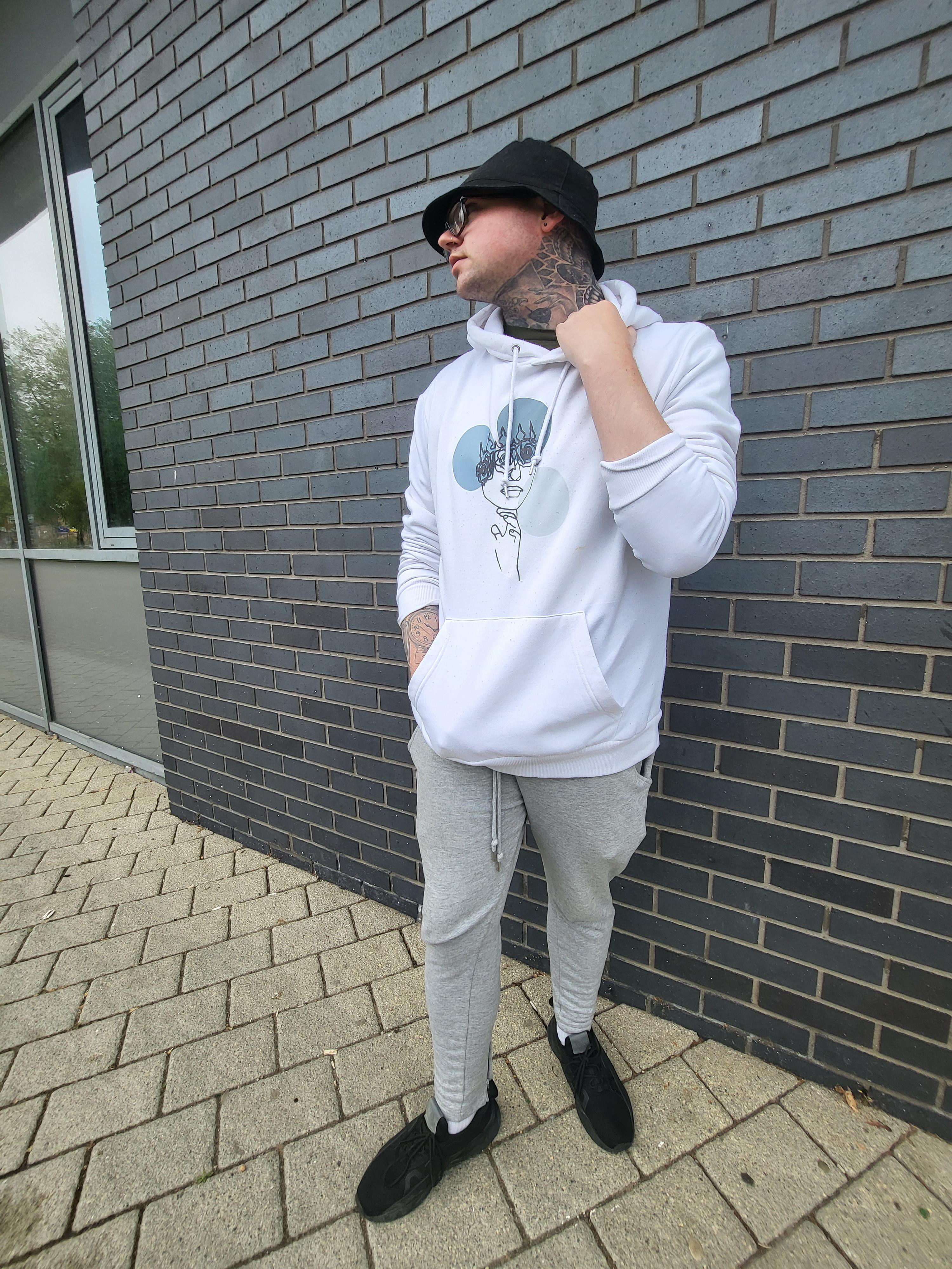
My aim with my design was to create an androgynous piece that forces my audience to confront mainstream ideas of what is "suitable" for a man or woman to wear. Putting my art on clothing allows many more people to see it as the consumer goes about their day-to-day lives, inspiring them to challenge their ideas of gender conformity or to wear the piece themselves. I wanted to present my work in a unique way - through fashion. I hope that this design allows people to stop limiting themselves to gendered clothing, eventually helping them to resist traditional gender roles as a whole.

Oscar Pulsford
University of Bournemouth BA (Hons) Graphic Design
University of Bournemouth BA (Hons) Graphic Design
Mind Over Matter
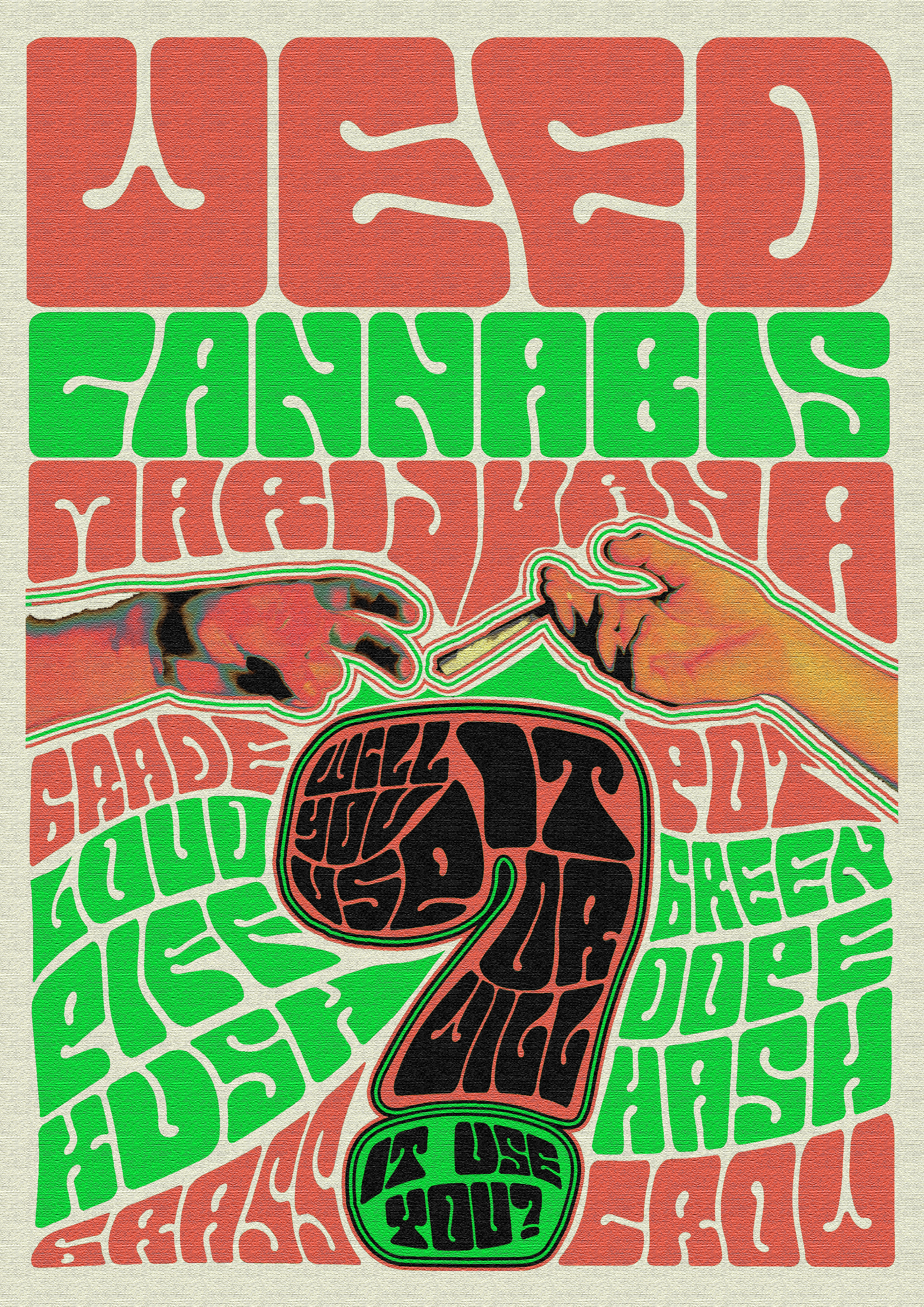
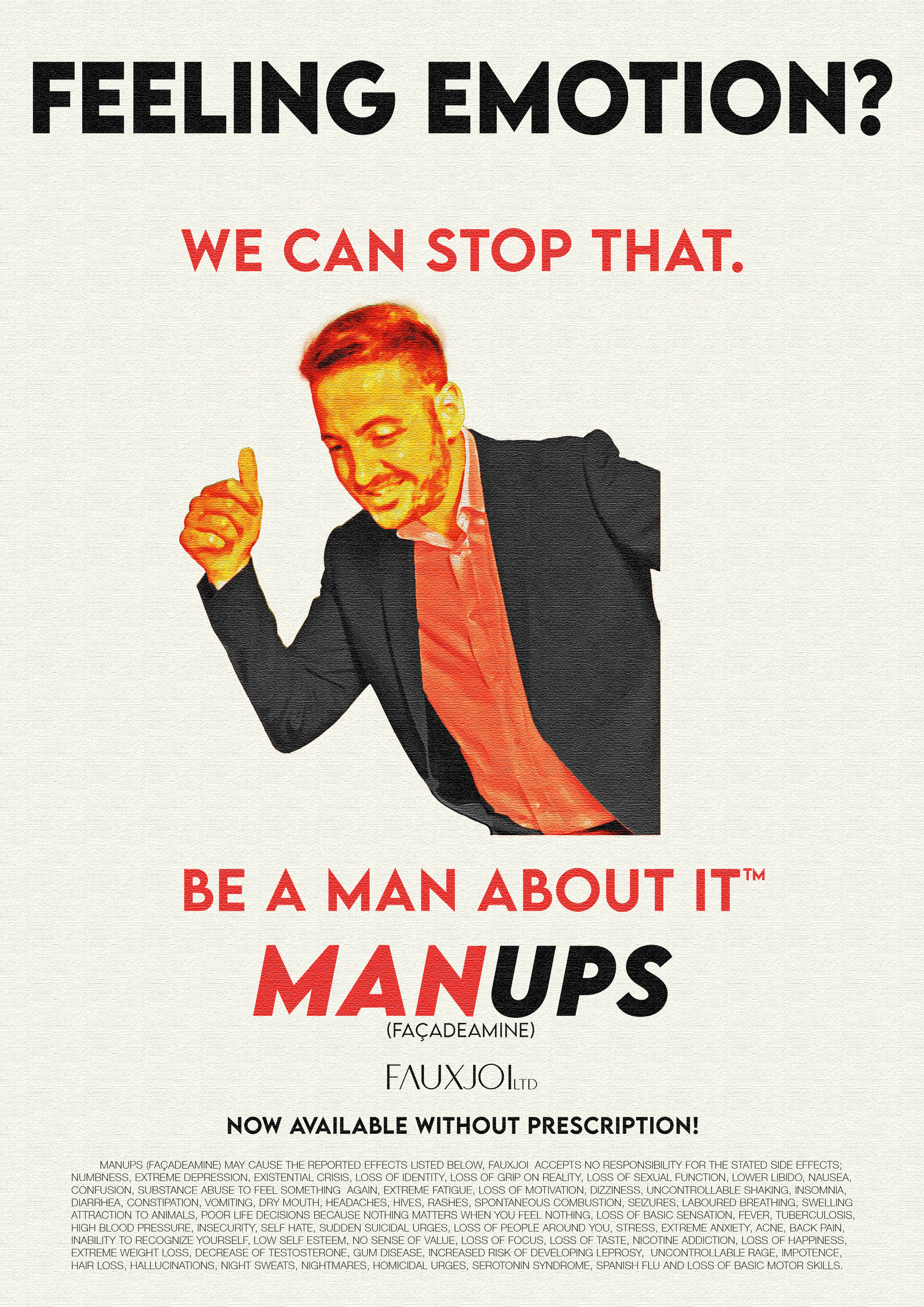
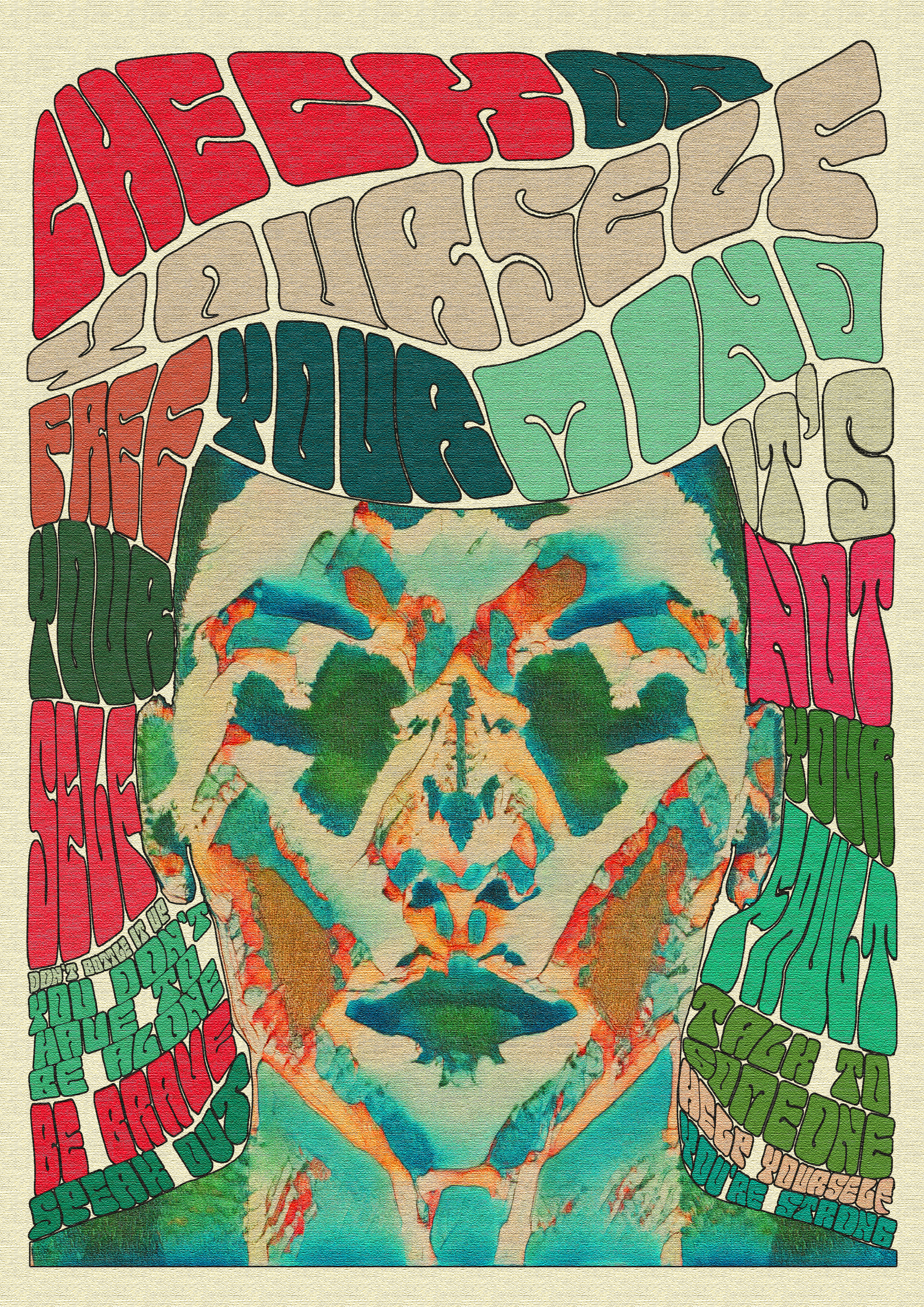
I have exhibited a series of three posters depicting aspects of life I believe to be of importance. There is a satirical social commentary on how men are expected to ‘man up’ and not have emotion, this piece also depicts the reliance of medication that affects the nation as we know it, with doctors handing out pills to anyone who’s had a bad day. The next poster is another satirical take on drug abuse, which is another problem that affects a lot of young people today. The last piece is about abuse in men, a very touchy subject that is often disregarded, mainly by other men. I have experienced it myself and know many others that have yet they all say the same thing “It’s embarrassing” or “People will think I’m weak”. I wanted to bring awareness to all these issues in my work. While the stylistics may seem happy, the content is serious. I hope you enjoy the work and understand what I am trying to convey.
I have exhibited a series of three posters depicting aspects of life I believe to be of importance. There is a satirical social commentary on how men are expected to ‘man up’ and not have emotion, this piece also depicts the reliance of medication that affects the nation as we know it, with doctors handing out pills to anyone who’s had a bad day. The next poster is another satirical take on drug abuse, which is another problem that affects a lot of young people today. The last piece is about abuse in men, a very touchy subject that is often disregarded, mainly by other men. I have experienced it myself and know many others that have yet they all say the same thing “It’s embarrassing” or “People will think I’m weak”. I wanted to bring awareness to all these issues in my work. While the stylistics may seem happy, the content is serious. I hope you enjoy the work and understand what I am trying to convey.
Fredy Rompao
University of Northampton BA (Hons) Interior architecture design
University of Northampton BA (Hons) Interior architecture design
Goat
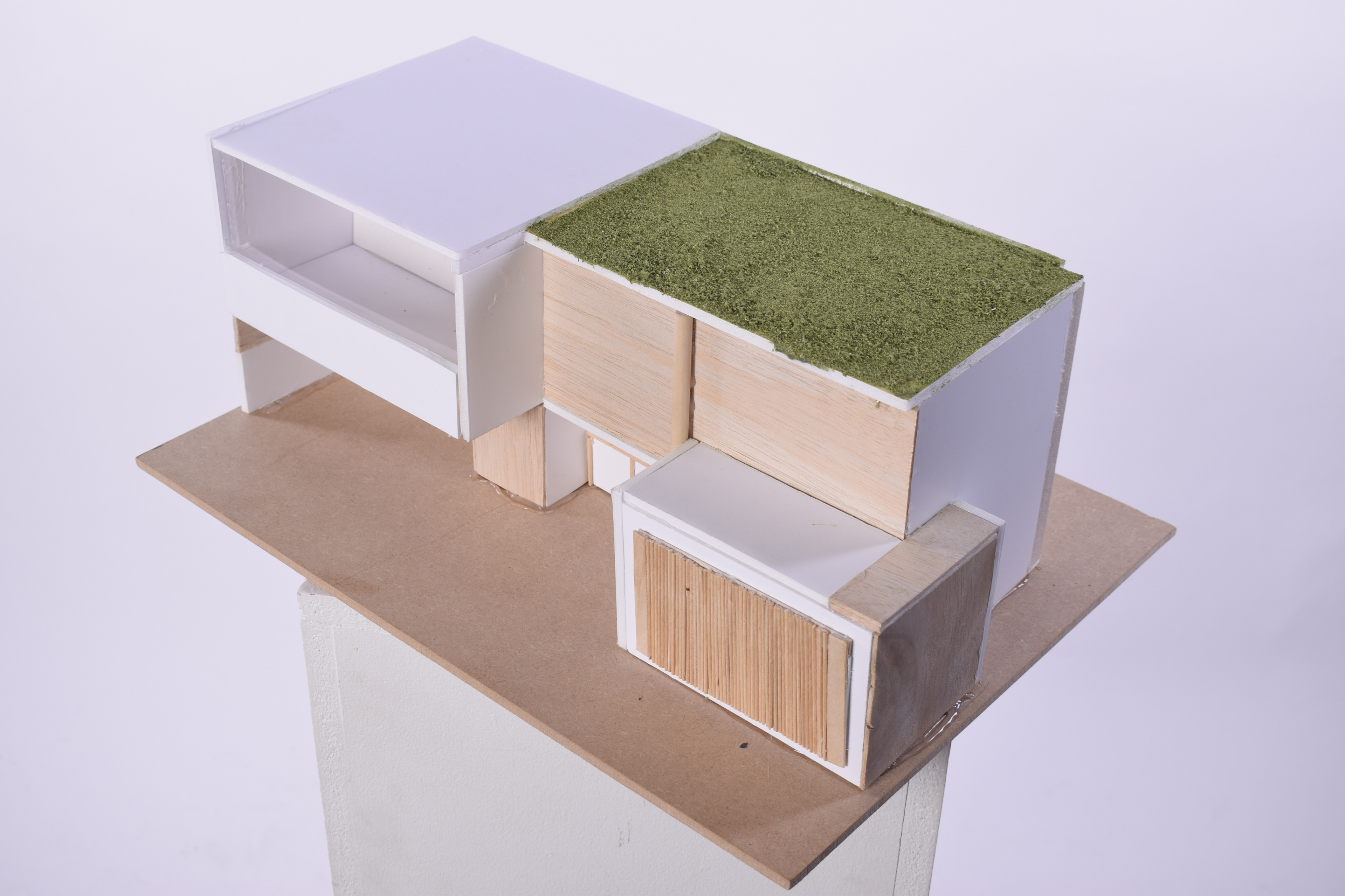
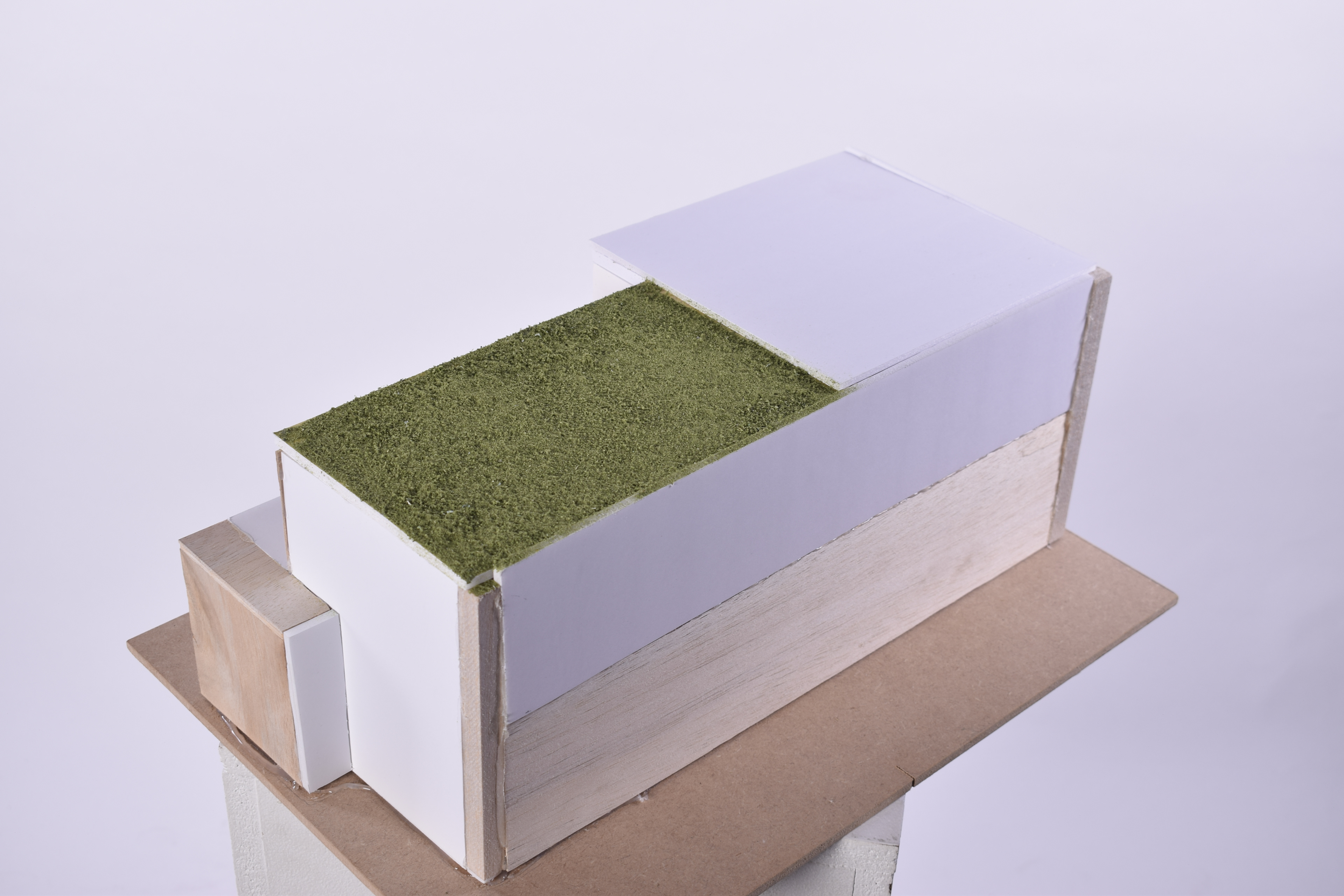
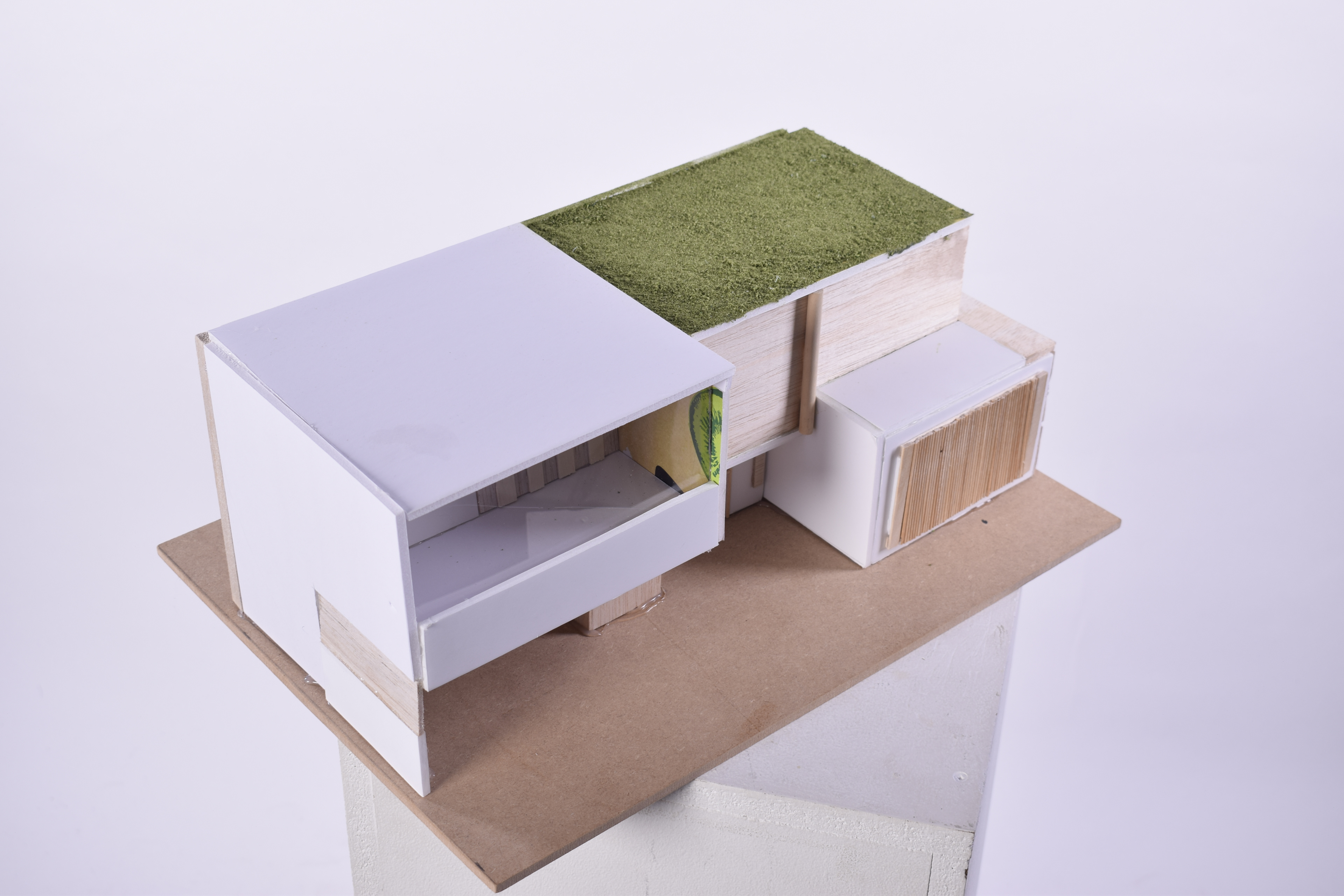
I have exhibited a 3D model of a house inspired by modern architecture and my personal style. With my theme being architecture, I have explored different styles to see which one would be best for me. The model has different materials such as wood, foam board and glass to imitate a more modern architecture look.
I have exhibited a 3D model of a house inspired by modern architecture and my personal style. With my theme being architecture, I have explored different styles to see which one would be best for me. The model has different materials such as wood, foam board and glass to imitate a more modern architecture look.
Kyla Simkins
Employment
Employment
My Body.
‘My Body.’ is a collection of different body types to show body positivity and acceptance. There are a total of eight different drawings all in line work, each piece highlights different insecurities that should be loved no matter who you are.
‘My Body.’ is a collection of different body types to show body positivity and acceptance. There are a total of eight different drawings all in line work, each piece highlights different insecurities that should be loved no matter who you are.
Jennifer Taylor
Employment
Employment
Nature
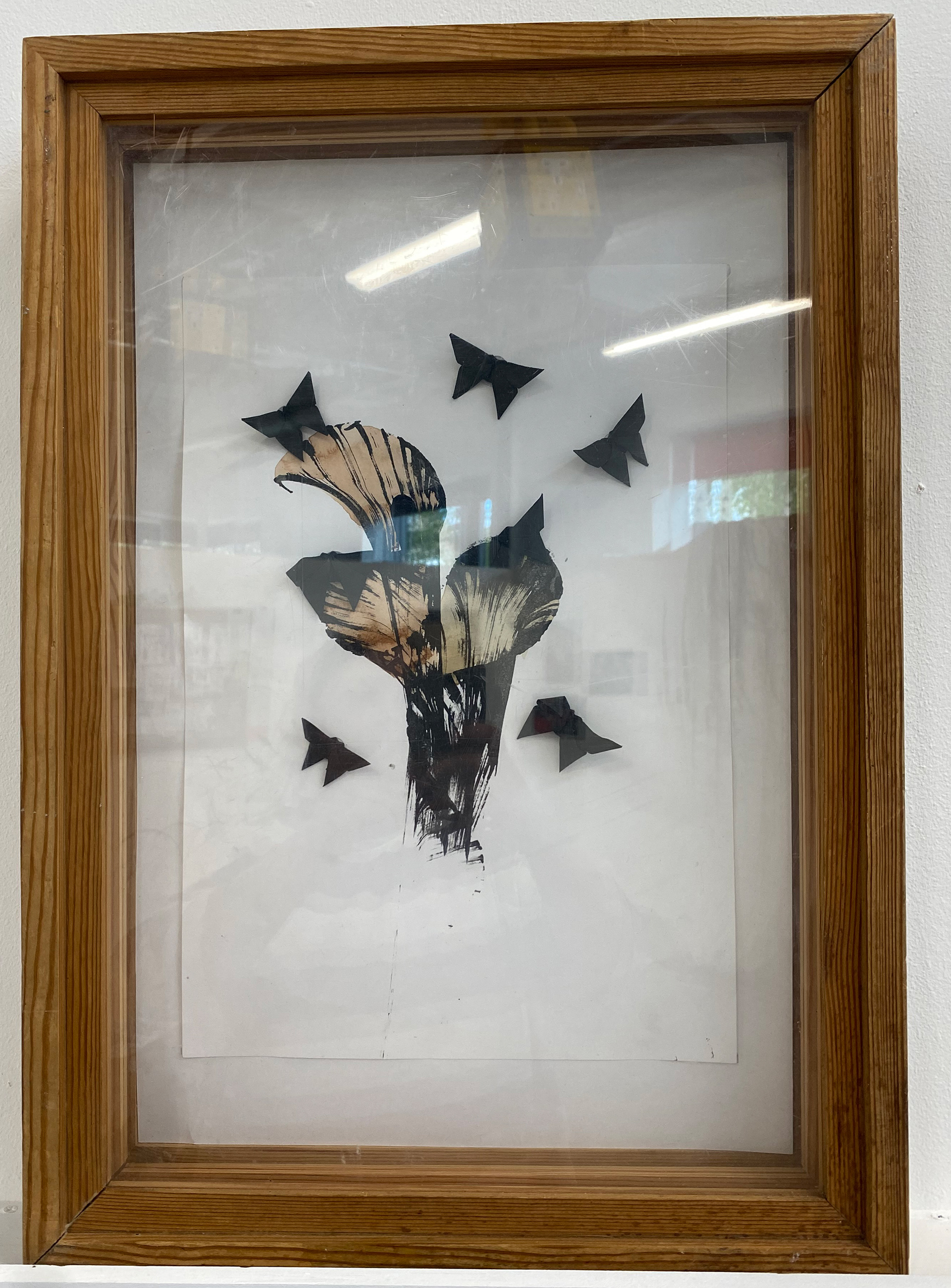
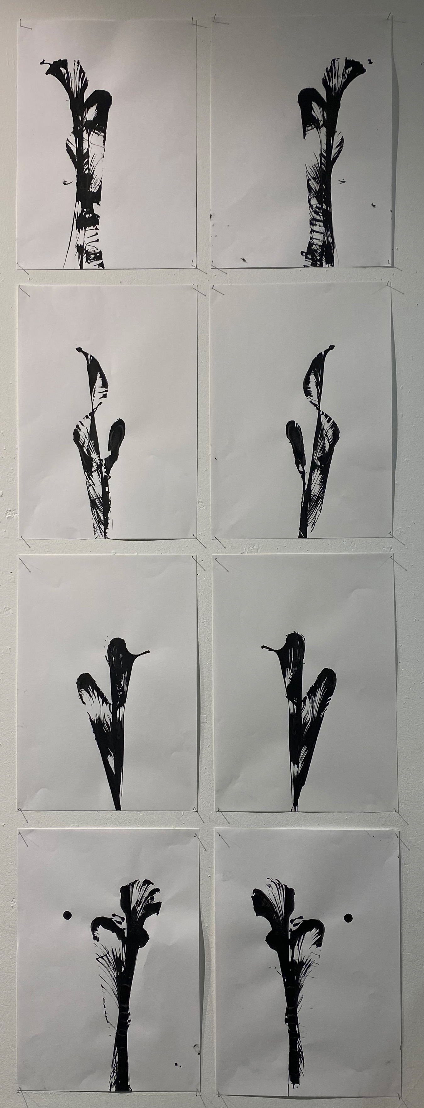
I have exhibited a pull string art piece. With my theme being ‘Nature’, I have explored different ways to create certain pull string patterns and created multiple experimental pull string art. The colours painted are natural dyes made from Clutch and Logwood. I wanted natural materials in my piece to reflect my theme. The butterflies represent that all nature is living even if it doesn't move like we do.
I have exhibited a pull string art piece. With my theme being ‘Nature’, I have explored different ways to create certain pull string patterns and created multiple experimental pull string art. The colours painted are natural dyes made from Clutch and Logwood. I wanted natural materials in my piece to reflect my theme. The butterflies represent that all nature is living even if it doesn't move like we do.
Lora Tincheva
Norwich University of the Arts, BA (Hons) Textile Design.
Norwich University of the Arts, BA (Hons) Textile Design.
Fashion in the Future
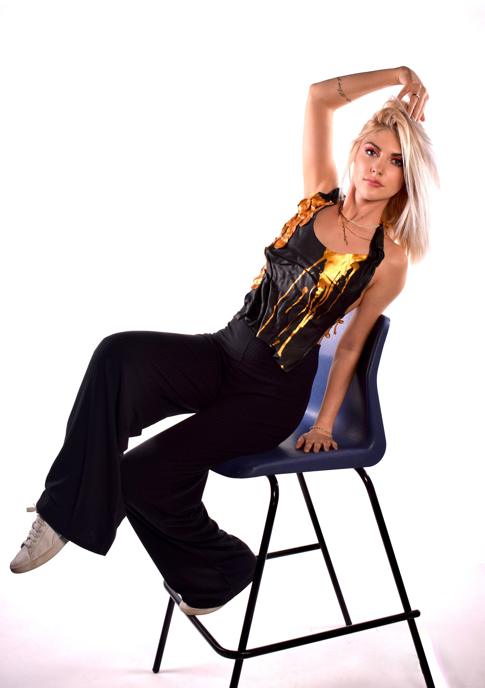
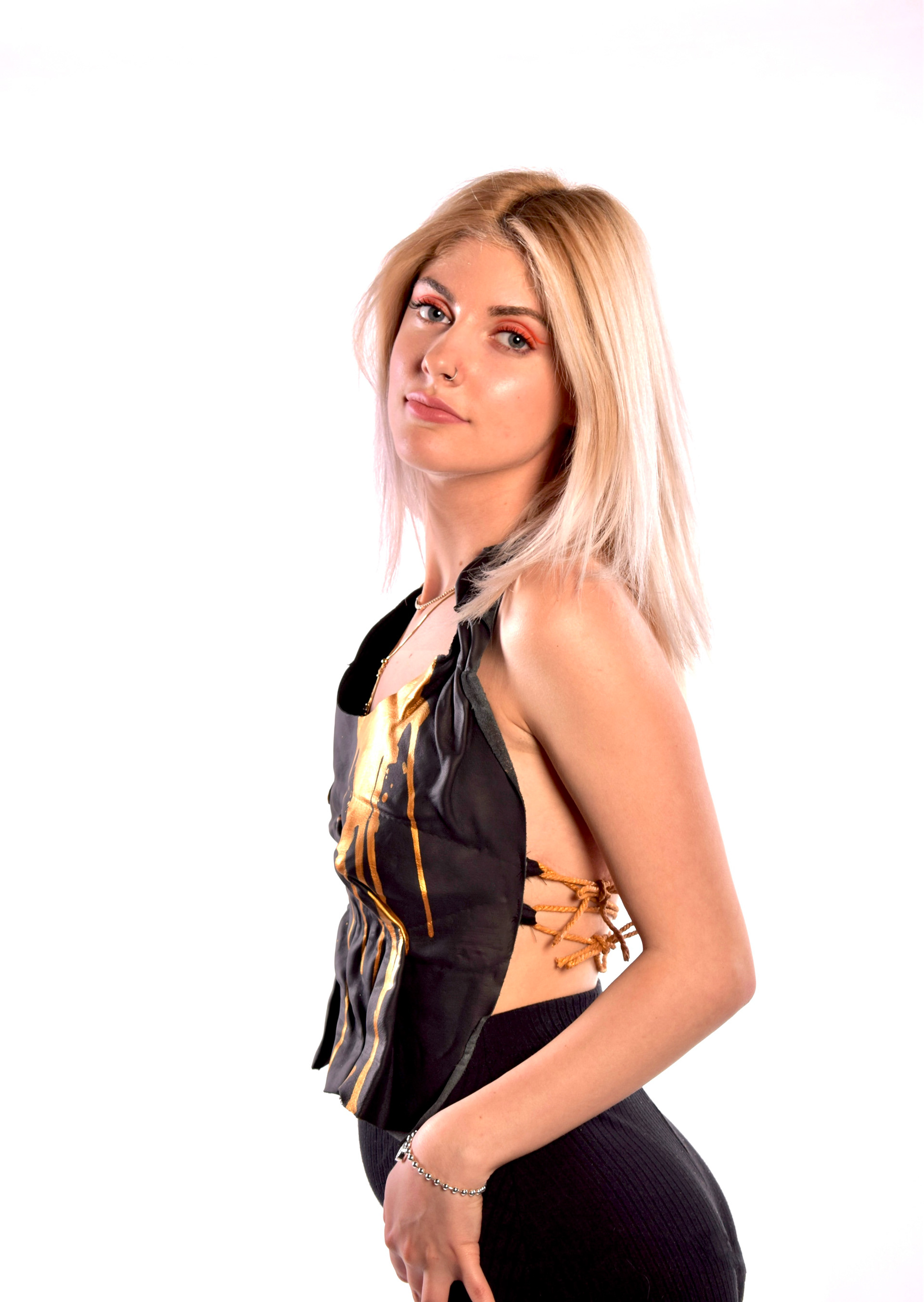
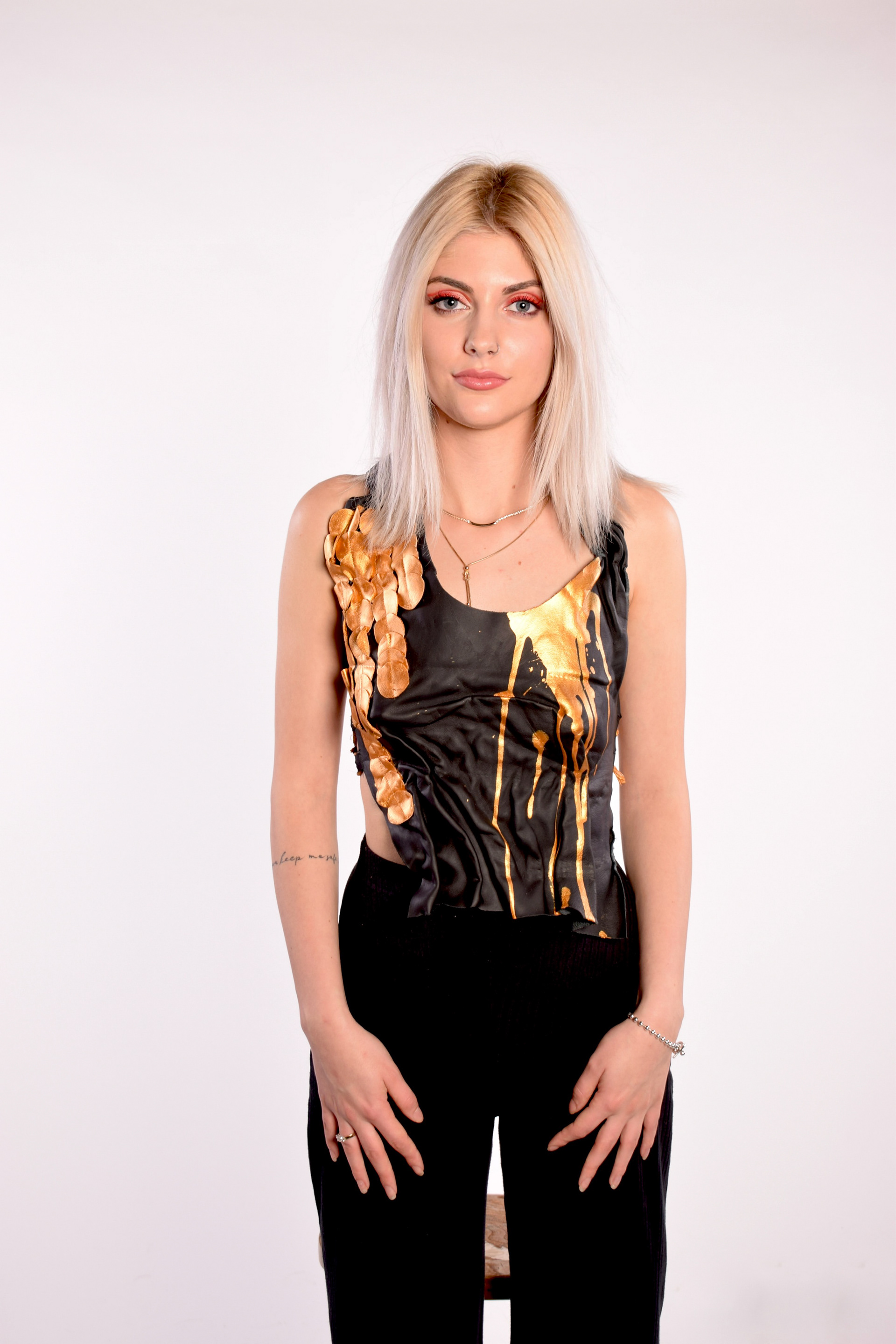
I have exhibited a piece of the collection “Fashion in the future”. Pre-cut circle leather pieces, layered on top of each other created a patterned/ textured effect on a top shaped as a human breast. With my theme “Fashion in the future” I have explored different ways to experiment and play around with pattern and fabric manipulation which became really interesting and successful. With this exhibited piece I have not only created top but also provided fabulous wet modelling methods and techniques that l can use in the time ahead. The top and the colour palette I've chosen represents my chosen theme. “Fashion in the future” in my opinion and the research l have found should be modern, bigger, bold,innovative,radical,sculptural ,avant-garde and architectural look with untypical shapes.
I have exhibited a piece of the collection “Fashion in the future”. Pre-cut circle leather pieces, layered on top of each other created a patterned/ textured effect on a top shaped as a human breast. With my theme “Fashion in the future” I have explored different ways to experiment and play around with pattern and fabric manipulation which became really interesting and successful. With this exhibited piece I have not only created top but also provided fabulous wet modelling methods and techniques that l can use in the time ahead. The top and the colour palette I've chosen represents my chosen theme. “Fashion in the future” in my opinion and the research l have found should be modern, bigger, bold,innovative,radical,sculptural ,avant-garde and architectural look with untypical shapes.
Georgia Toop
University of Suffolk BA (Hons) Fine Art
University of Suffolk BA (Hons) Fine Art
Ideas of death and Poverty in Victorian Britain
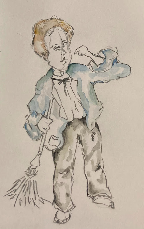
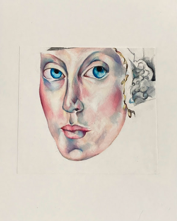
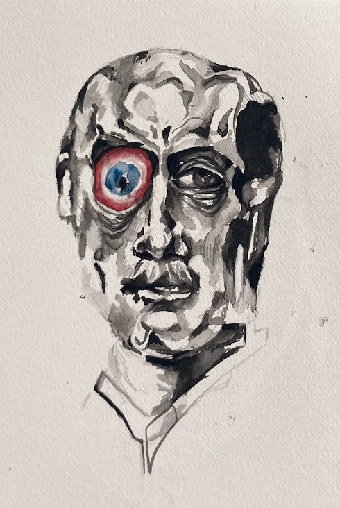
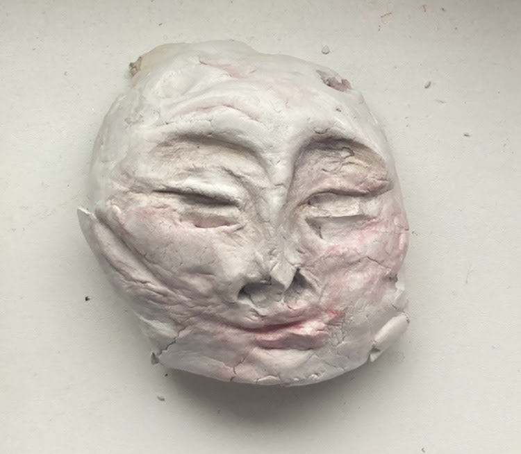
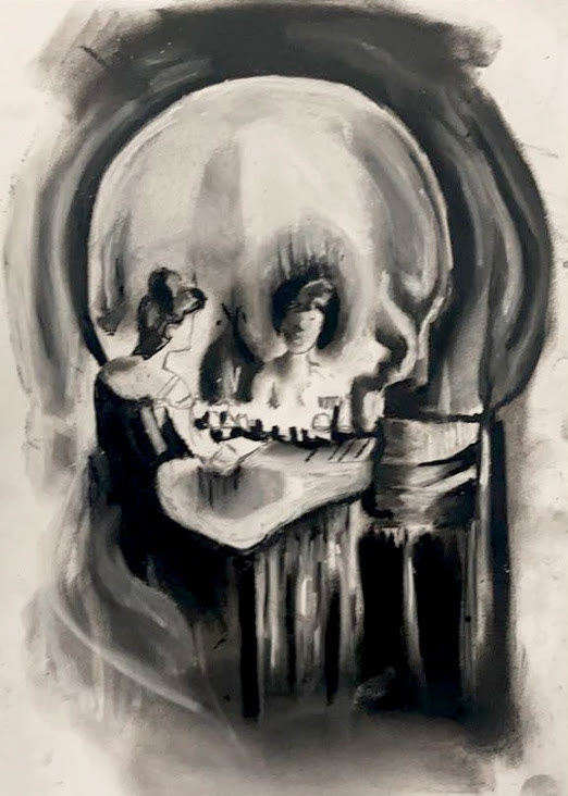
I have exhibited a range of work from painting and sculpture to capture my theme of Victorian Britain. I have really enjoyed this project as I have been able to explore and develop my artistic style, and research into a topic that really interests me. I have created different pieces of art to explore and show the effects of poverty and death in the Victorian period. I feel that I have really captured the morbidness of my theme, and hope people feel different emotions when looking at my work.
I have exhibited a range of work from painting and sculpture to capture my theme of Victorian Britain. I have really enjoyed this project as I have been able to explore and develop my artistic style, and research into a topic that really interests me. I have created different pieces of art to explore and show the effects of poverty and death in the Victorian period. I feel that I have really captured the morbidness of my theme, and hope people feel different emotions when looking at my work.

Holly Walker
Employment
Employment
Dolls
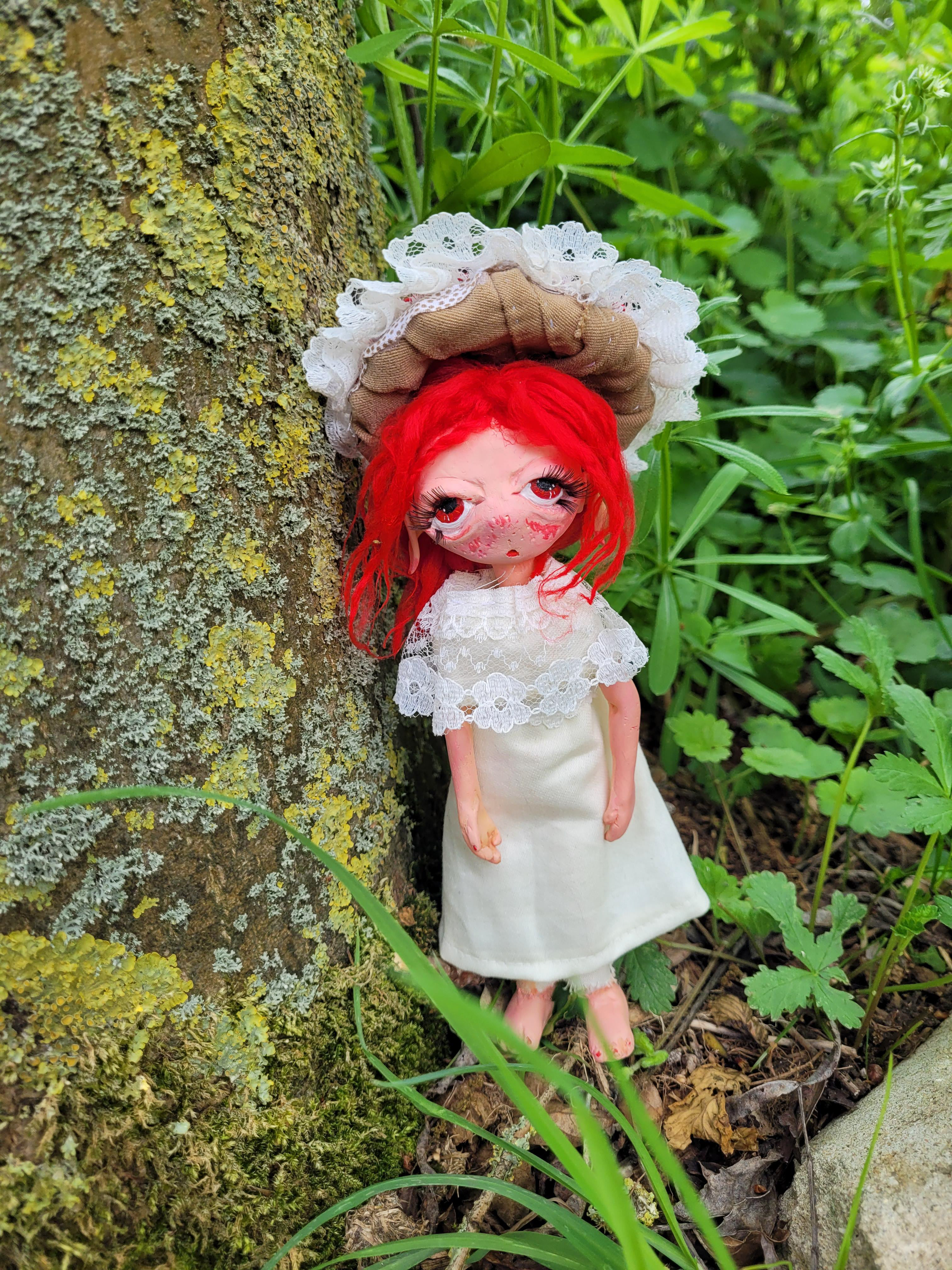
I have exhibited a mushroom fairy doll. I made this to fit in with my theme, ‘dolls and figures’. The doll has polymer clay face, arms and feet while the rest is made out of a range of textile pieces. The dress and its colours are inspired by a classic fairytale red mushroom/toadstool. This doll comes with a small collection of watercolor paintings depicting the fairy with its friends. I choose watercolor due to its whimsical look and feel. Even the warped paper makes the images look old and pre-loved, something that could make you nostalgic about your own childhood.
I have exhibited a mushroom fairy doll. I made this to fit in with my theme, ‘dolls and figures’. The doll has polymer clay face, arms and feet while the rest is made out of a range of textile pieces. The dress and its colours are inspired by a classic fairytale red mushroom/toadstool. This doll comes with a small collection of watercolor paintings depicting the fairy with its friends. I choose watercolor due to its whimsical look and feel. Even the warped paper makes the images look old and pre-loved, something that could make you nostalgic about your own childhood.


